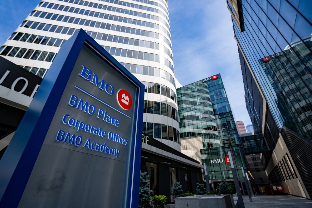
In today’s competitive business landscape, every detail matters when it comes to making a lasting impression. One often overlooked yet crucial element in your corporate environment is office signage. At Tupp Signs, we’ve been helping businesses in Wilmington, Delaware, and beyond create impactful signage since 1928. We understand that well-designed office signs are more than just wayfinding tools – they’re powerful brand ambassadors that can transform your workspace and leave a lasting impression on both employees and visitors.
Key Takeaways
- Office signage is a powerful tool for brand communication and employee engagement
- Consistency with brand guidelines is crucial for effective corporate signage
- Balancing aesthetics and functionality ensures signs are both beautiful and useful
- Consider scalability and ADA compliance when designing your signage strategy
- Innovative approaches like biophilic design and interactive signs can set your office apart
- Measure the impact of your signage through employee feedback and visitor experience assessments
- Avoid common pitfalls like overcrowding and inconsistent brand application
- Budget wisely by considering long-term value and ROI of your signage investment
- Stay ahead of trends like AR integration and smart, IoT-connected signs
- Partner with an experienced sign company like Tupp Signs to bring your brand identity to life
Comparison Table: Traditional vs. Modern Corporate Office Signage
Aspect |
Traditional Signage |
Modern Signage |
Materials |
Mostly static (e.g., metal, plastic) | Dynamic (e.g., digital displays, sustainable materials) |
Customization |
Limited, often generic | Highly customizable, brand-specific |
Interactivity |
Passive, one-way communication | Interactive, engaging (e.g., touchscreens, AR) |
Flexibility |
Fixed content, difficult to update | Easily updatable, often in real-time |
Accessibility |
Basic ADA compliance | Enhanced accessibility features (e.g., audio guidance) |
Integration |
Standalone elements | Integrated with office systems and employee devices |
Environmental Impact |
Varied, often higher | Focus on sustainability and eco-friendly materials |
Brand Alignment |
Basic logo and color usage | Comprehensive brand experience and storytelling |
Data Collection |
Limited or no data gathering | Can provide insights on traffic flow and engagement |
Cost Over Time |
Lower initial cost, higher for updates | Higher initial investment, lower long-term costs |
The Power of Office Signage in Brand Representation
Your office signs are silent salespeople, constantly communicating your brand’s values, personality, and professionalism. From the moment someone steps into your reception area to their journey through various departments, every sign they encounter contributes to their overall perception of your company.
Well-designed corporate signs can:
- Reinforce brand recognition
- Create a cohesive and professional atmosphere
- Improve employee morale and sense of belonging
- Enhance visitor experience and navigation
- Showcase your company’s attention to detail
At Tupp Signs, we’ve seen firsthand how custom storefront signs and interior office signage can dramatically transform a space. Our expertise in creating everything from cabinet signs to channel letter signs ensures that your brand identity is consistently represented throughout your office environment.
Understanding Your Brand Identity: The Foundation of Effective Signage
Before diving into sign design, it’s crucial to have a clear understanding of your brand identity. This forms the foundation upon which all your signage decisions will be built.
Defining Your Brand’s Core Values and Mission
Your brand’s core values and mission are the heart of your company. They should be reflected in every aspect of your business, including your office signs. Ask yourself:
- What does your company stand for?
- What makes you unique in your industry?
- What message do you want to convey to employees and visitors?
For example, if sustainability is a core value, you might opt for eco-friendly materials in your signage. If innovation is key, you could incorporate digital or interactive elements into your signs.
Identifying Key Visual Elements of Your Brand
Your brand’s visual identity includes elements like:
- Colors: Use your brand colors consistently in your signage. Color psychology plays a significant role in how your brand is perceived.
- Fonts: Choose typography that aligns with your brand personality. A tech startup might use sleek, modern fonts, while a law firm might opt for more traditional typefaces.
- Logos: Incorporate your logo strategically throughout your office signage. This could range from a prominent display in your reception area to subtle integration in directional signs.
At Tupp Signs, we specialize in creating custom business signs that perfectly capture these visual elements. Our expertise in front-lit channel letters and reverse channel letter signs allows us to bring your logo and brand colors to life in stunning, three-dimensional displays.
Analyzing Your Target Audience and Company Culture
Consider who will be interacting with your signs daily. Are they primarily employees, clients, or both? Your company culture should also play a role in your signage design. A creative agency might opt for playful, artistic signs, while a financial institution might prefer more conservative, elegant designs.
Types of Corporate Office Signs and Their Impact
Now that we’ve covered the importance of understanding your brand identity, let’s explore the various types of office signs and their impact on your overall brand representation.
Reception Area Signs
Your reception area is often the first point of contact for visitors, making it a critical location for impactful signage. A well-designed reception sign sets the tone for the entire visit. Consider using:
- Illuminated cabinet signs for a striking first impression
- Dimensional letters for a sophisticated look
- Digital displays for dynamic messaging
Wayfinding and Directional Signs
Clear, branded wayfinding signs not only help visitors navigate your office but also reinforce your brand identity throughout the space. These can include:
- Floor directories
- Directional arrows
- Department identifiers
Department and Room Identification Signs
These signs help organize your space while providing opportunities to reinforce your brand. Consider using your brand colors and fonts consistently across all room and department signs for a cohesive look.
Wall Graphics and Motivational Signage
Transform blank walls into powerful brand statements with custom wall graphics. These can include:
- Your company’s mission statement
- Inspirational quotes that align with your values
- Visual representations of your company’s history or achievements
Digital Displays and Interactive Signs
For a modern touch, consider incorporating digital signage. These versatile displays can:
- Share real-time information
- Showcase your portfolio or products
- Display welcome messages for visitors
At Tupp Signs, we offer a wide range of signage solutions to meet all these needs. From traditional cabinet signs to cutting-edge digital displays, we have the expertise to create a cohesive signage strategy that powerfully reflects your brand identity.
Ready to transform your office space with custom signs that truly represent your brand? Contact Tupp Signs today! Fill out our contact form, and our team of signage experts will help you create a comprehensive signage strategy that elevates your brand and enhances your office environment. Let’s work together to make your corporate identity shine!
Key Design Principles for Brand-Reflective Signs
Creating signs that truly embody your brand goes beyond just slapping a logo on a wall. At Tupp Signs, we’ve honed our craft since 1928, and we understand the nuances of designing signs that not only look great but also effectively communicate your brand identity.
Consistency with Brand Guidelines
Your brand guidelines are the cornerstone of your visual identity. Ensuring that your office signs align with these guidelines is crucial for maintaining a cohesive brand image. This includes:
- Using approved color palettes
- Implementing correct logo usage
- Adhering to typography standards
Our team at Tupp Signs works closely with your brand guidelines to create signage that seamlessly integrates with your existing brand materials.
Balancing Aesthetics and Functionality
While it’s important for your signs to look good, they must also serve their primary purpose: conveying information. Striking the right balance between eye-catching design and clear communication is key. This might mean:
- Using contrasting colors for better readability
- Ensuring appropriate font sizes for viewing distance
- Incorporating illumination for 24/7 visibility
Whether we’re crafting illuminated cabinet signs or sleek channel letter signs, we always prioritize both form and function.
Scalability and Adaptability Across Different Office Spaces
Your signage strategy should work cohesively across various areas of your office, from the grand entrance to individual workspaces. Consider how your designs will scale:
- Can your logo be effectively represented in both large and small formats?
- Do your chosen materials work well in different environments (e.g., outdoors vs. indoors)?
- How will your signage adapt to potential office expansions or relocations?
At Tupp Signs, we think ahead, creating versatile designs that can grow with your business.
Accessibility and ADA Compliance Considerations
Inclusive design isn’t just good practice – it’s often a legal requirement. Ensuring your signs are accessible to all includes:
- Using high-contrast color combinations
- Incorporating Braille and tactile elements
- Adhering to ADA guidelines for mounting heights and character sizes
Our expertise in ADA-compliant signage ensures that your brand-reflective signs are both beautiful and accessible.

Incorporating Brand Elements into Sign Design
Now that we’ve covered the key principles, let’s dive into how to effectively incorporate your brand elements into your sign designs.
Strategic Use of Company Colors and Color Psychology
Colors evoke emotions and associations. Use your brand colors strategically to:
- Create the right mood in different office areas
- Highlight important information
- Guide visitors through your space
Remember, color combinations can affect readability. Our design team can help you strike the perfect balance between brand fidelity and practical legibility.
Typography Choices That Reinforce Brand Personality
Your font choices speak volumes about your brand. Consider:
- Using your brand’s primary font for main messaging
- Complementing with secondary fonts for detailed information
- Adjusting typography for different sign types (e.g., bolder for wayfinding, more delicate for inspirational quotes)
From classic serif fonts to modern sans-serif options, we’ll help you choose typography that reinforces your brand personality.
Integrating Logos and Brand Symbols Effectively
Your logo is the centerpiece of your brand identity. We can help you showcase it effectively by:
- Creating three-dimensional logo signs for reception areas
- Incorporating your logo subtly into wayfinding signage
- Using your logo as inspiration for custom sign shapes
Our expertise in fabricating everything from simple vinyl graphics to complex channel letter signs ensures your logo always looks its best.
Using Materials That Reflect Brand Qualities
The materials you choose for your signs can reinforce your brand qualities. For example:
- Eco-friendly materials for sustainability-focused brands
- High-tech materials like LED-embedded acrylic for tech companies
- Premium metals or stone for luxury brands
At Tupp Signs, we offer a wide range of materials to match your brand’s unique personality and values.
Innovative Approaches to Corporate Signage
Stay ahead of the curve with these cutting-edge signage solutions.
Biophilic Design Elements in Signage
Bringing nature into the workplace isn’t limited to potted plants. Consider:
- Living walls with integrated signage
- Natural materials like wood or stone in sign construction
- Nature-inspired shapes and patterns in sign designs
Interactive and Technology-Integrated Signs
Engage your employees and visitors with interactive signage:
- Touchscreen directories
- QR code-enabled signs linking to digital content
- Augmented reality experiences triggered by signage
Customizable and Changeable Signage Solutions
In today’s fast-paced business world, flexibility is key. We offer solutions like:
- Modular sign systems for easy updates
- Digital displays for real-time information
- Magnetic or slide-in panels for quick content changes
Artistic and Sculptural Sign Designs
Transform your signs into conversation pieces with:
- Custom-shaped dimensional signs
- Artistic interpretations of your logo or brand elements
- Integration of local art or cultural elements
The Sign Design Process: From Concept to Installation
At Tupp Signs, we’ve refined our design and installation process to ensure stellar results every time.
Conducting a Comprehensive Site Survey
We start by thoroughly assessing your space, considering:
- Viewing distances and angles
- Lighting conditions
- Architectural features and constraints
Collaborative Brainstorming and Concept Development
We work closely with you to develop concepts that align with your vision, brand, and budget.
Creating Mock-Ups and Prototypes
See your signs come to life before production with:
- Digital renderings
- Material samples
- Scale models for larger installations
Getting Stakeholder Feedback and Approval
We facilitate the review process, ensuring all decision-makers are aligned before moving forward.
Manufacturing and Quality Control
Our state-of-the-art manufacturing facility in Wilmington, Delaware, ensures top-notch quality for every sign we produce.
Professional Installation and Placement Strategies
Our experienced installation team ensures your signs are perfectly placed for maximum impact and longevity.
Ready to elevate your office environment with custom, brand-reflective signage? Don’t wait to make a lasting impression on your employees and visitors. Contact Tupp Signs today by filling out our online form. Our expert team is ready to guide you through the entire process, from initial concept to final installation. Let’s create signage that truly showcases your brand identity and transforms your workspace!
Measuring the Impact of Your Office Signs
Investing in custom office signage is a significant decision for any business. At Tupp Signs, we believe in the power of data-driven design. Here’s how you can measure the impact of your new signage:
Employee Feedback and Satisfaction Surveys
Your team interacts with your office signs daily. Their feedback is invaluable. Consider:
- Conducting pre- and post-installation surveys
- Including questions about wayfinding ease and brand representation
- Encouraging open-ended feedback for improvement suggestions
Visitor Experience Assessments
First impressions matter. Assess how your signage affects visitors:
- Use short, post-visit surveys
- Monitor receptionist feedback on visitor questions or confusion
- Track compliments or comments about your office environment
Brand Recall and Recognition Studies
Effective signage boosts brand recognition. Measure this through:
- Quick brand association tests with visitors
- Comparing brand recall rates before and after new signage installation
- Analyzing social media mentions or photos of your office space
Analyzing Foot Traffic Patterns and Wayfinding Efficiency
Efficient navigation can significantly impact productivity. Consider:
- Using heat mapping tools to analyze movement patterns
- Tracking the time it takes for new visitors to find key areas
- Monitoring the frequency of wayfinding questions to receptionists or employees
At Tupp Signs, we can help you set up these measurement strategies, ensuring your investment in custom storefront signs and interior office signage delivers tangible results.
Case Studies: Successful Corporate Office Sign Designs
Let’s explore how different companies have successfully implemented brand-reflective signage with Tupp Signs’ expertise:
Tech Giant’s Innovative Use of Digital Signage
Challenge: A rapidly growing tech company needed flexible signage that could keep up with their dynamic office environment.
Solution: Tupp Signs implemented a network of digital displays throughout the office, featuring:
- Real-time meeting room availability
- Company news and social media feeds
- Interactive wayfinding kiosks
Result: The company saw a 30% reduction in meeting room booking confusion and a 25% increase in employee engagement with company communications.
Eco-Friendly Company’s Sustainable Signage Approach
Challenge: An environmental consulting firm wanted signage that reflected their commitment to sustainability.
Solution: We created a comprehensive signage system using:
- Reclaimed wood for dimensional lobby signs
- Low-VOC paints for wall graphics
- Solar-powered illuminated signs for exterior branding
Result: The company’s brand perception scores increased by 40% among clients, and employee satisfaction with the office environment rose by 35%.
Law Firm’s Elegant and Professional Sign Design
Challenge: A prestigious law firm needed to update their office signage to reflect their heritage while appealing to modern clients.
Solution: Tupp Signs developed a signage strategy featuring:
- Brushed metal dimensional letters for the reception area
- Frosted glass signs with etched details for conference rooms
- Subtle, backlit signs for after-hours visibility
Result: Client survey responses showed a 50% increase in perception of the firm’s professionalism, and partner satisfaction with the office aesthetic increased by 60%.
Creative Agency’s Playful Yet Brand-Aligned Office Signs
Challenge: A creative agency wanted office signage that showcased their innovative spirit without compromising professionalism.
Solution: Our team created a playful yet cohesive signage system, including:
- An interactive wall in the lobby that clients could rearrange
- Department signs inspired by famous artworks, customized with agency branding
- Whimsical wayfinding signs that doubled as conversation pieces
Result: The agency saw a 45% increase in social media mentions of their office space, and employee-led office tours increased by 70%.
Common Pitfalls to Avoid in Corporate Sign Design
Even with the best intentions, it’s easy to fall into common signage traps. Here’s what to watch out for:
Overcrowding or Information Overload
Less is often more when it comes to signage. Avoid:
- Cramming too much text onto a single sign
- Using overly complex graphics that are hard to understand at a glance
- Cluttering spaces with too many signs
Tupp Signs can help you strike the right balance between informative and overwhelming.
Neglecting Scalability and Future Growth
Your signage should be able to grow with your company. Be wary of:
- Designs that are too specific to your current office layout
- Materials or technologies that may become quickly outdated
- Ignoring potential future rebranding or expansion needs
Our team thinks ahead, creating flexible signage solutions that can adapt to your evolving needs.
Inconsistent Application of Brand Elements
Consistency is key in branding. Watch out for:
- Varying color shades across different signs
- Inconsistent use of fonts or logo placement
- Mixing conflicting design styles throughout the office
With our comprehensive approach, we ensure your brand identity is consistently represented across all signage.
Prioritizing Trends Over Timeless Design
While it’s great to be current, your signage should stand the test of time. Avoid:
- Overly trendy designs that may look dated quickly
- Sacrificing clarity for the sake of being cutting-edge
- Ignoring your company’s long-term brand vision
At Tupp Signs, we balance contemporary appeal with timeless design principles to create signage that remains relevant for years to come.
By understanding these common pitfalls and learning from successful case studies, you’re well on your way to creating impactful, brand-reflective office signs. Remember, great signage is an investment in your brand, your employees’ experience, and your company’s future.
Ready to transform your office space with custom signs that truly represent your brand while avoiding common design pitfalls? Contact Tupp Signs today! Fill out our contact form, and our experienced team will guide you through the process, ensuring your signage not only looks great but also delivers measurable results for your business. Let’s create signage that stands the test of time and elevates your brand to new heights!
Budgeting and ROI Considerations for Office Signage
Investing in high-quality, brand-reflective office signage is a strategic decision that can yield significant returns. At Tupp Signs, we believe in transparency when it comes to budgeting and helping our clients understand the value of their investment.
Cost Factors in Sign Design and Production
Several elements influence the cost of your signage project:
- Materials: From basic vinyl to premium metals or illuminated options
- Complexity: Simple text vs. intricate designs or 3D elements
- Size and quantity: Larger signs or multiple units can affect pricing
- Technology integration: Digital or interactive elements may increase costs
Our team at Tupp Signs works with you to find the best solutions that fit your budget without compromising on quality or brand impact.
Long-term Value and Durability Considerations
When budgeting for signage, consider the long-term value:
- Durability of materials: Higher quality materials may cost more upfront but last longer
- Maintenance requirements: Some signs may need regular upkeep, affecting long-term costs
- Flexibility for updates: Modular or digital signs can be more cost-effective for businesses that frequently update information
We specialize in creating signage solutions that offer the best balance of initial investment and long-term value.
Balancing Quality and Budget Constraints
It’s possible to create impactful signage even with budget limitations:
- Prioritize key areas: Invest in high-impact zones like reception areas
- Phase your project: Implement your signage strategy in stages
- Mix materials: Combine premium elements with more cost-effective options
Our experienced designers can help you make smart choices that maximize your budget’s impact.
Calculating the Return on Investment for Branded Office Signs
Measuring ROI on signage involves both tangible and intangible factors:
- Increased brand recognition and recall
- Improved employee productivity through better wayfinding
- Enhanced visitor experiences leading to better business relationships
- Potential increase in social media mentions and word-of-mouth marketing
We can help you set up metrics to track these factors and demonstrate the value of your signage investment.
Future Trends in Corporate Office Signage
At Tupp Signs, we’re always looking ahead to bring you the latest innovations in signage. Here are some exciting trends to watch:
Augmented Reality Integration
AR is set to revolutionize how we interact with signs:
- Interactive building directories that guide visitors through AR on their phones
- Signs that reveal additional information or animations when viewed through AR apps
- Virtual tours triggered by physical signage
Smart, IoT-Connected Signs
The Internet of Things is making signs smarter:
- Digital signs that update automatically based on real-time data
- Occupancy-sensing signs for meeting rooms and workspaces
- Signs that interact with employees’ and visitors’ devices for personalized experiences
Sustainable and Eco-Friendly Signage Materials
Sustainability is more than a trend; it’s a necessity:
- Biodegradable and recycled materials for temporary signage
- Energy-efficient LED technology for illuminated signs
- Signs made from reclaimed or upcycled materials
As a company with roots dating back to 1928, Tupp Signs understands the importance of sustainable practices for long-term success.
Personalized and Adaptive Sign Content
The future of signage is dynamic and responsive:
- Signs that change content based on the viewer or time of day
- Mood-responsive signs that adapt to office atmosphere or events
- Customizable digital signs that employees can personalize for their workspaces
Conclusion
Recap of Key Points for Designing Brand-Reflective Office Signs
Throughout this guide, we’ve explored the crucial elements of creating office signs that powerfully reflect your brand identity:
- Understanding your brand identity and core values
- Choosing the right types of signs for different areas of your office
- Implementing key design principles for brand consistency
- Incorporating innovative approaches and materials
- Measuring the impact of your signage
- Avoiding common pitfalls in sign design
- Considering budget and ROI factors
- Staying ahead with future trends in corporate signage
Encouragement to View Signage as a Strategic Brand Asset
Your office signage is more than just wayfinding or decoration – it’s a powerful tool for brand communication, employee engagement, and visitor experience. By approaching your signage strategy with the same care and consideration as your other marketing efforts, you can create a cohesive, impactful brand experience throughout your office space.
Call-to-Action for Businesses to Reassess and Enhance Their Office Signage
Is your current office signage truly reflecting your brand identity and values? Are you leveraging the latest technologies and design trends to create an impactful office environment? If not, it’s time to reassess and enhance your signage strategy.
At Tupp Signs, we bring nearly a century of experience combined with cutting-edge techniques to help businesses in Wilmington, Delaware, and beyond create office signage that makes a lasting impression. From custom storefront signs to innovative interior office signage, we have the expertise to bring your brand to life in your workspace.
Ready to transform your office with brand-reflective, innovative signage? Don’t let outdated or inconsistent signs hold your brand back. Contact Tupp Signs today by filling out our online form. Our team of experts is eager to help you create a signage strategy that not only looks great but also delivers measurable results for your business. Let’s work together to design office signs that truly power your brand identity and set your business apart!


