
All businesses must find new ways to bring potential customers to their doors. While you might think it is as easy as hanging a simple sign, you might only see a slight uptick in customers. You want to have outdoor signage that stands out. Here are a few ways to make your signage readable, attractive, and impactful.
Font Choice
When you install a sign, you want it to be seen at various distances. Generally, many people will start to notice signs 100 feet away. With that in mind, you want to use fonts that potential customers can read at a comfortable distance. If you want your signage to stand out, the font should be at least 10 inches tall. At that size, drivers and pedestrians can clearly read the sign. For those businesses that may not be located near a road, a 3-inch font can be seen by those who walk by your store or space.
You will also want to avoid certain fonts, such as cursive letters, especially at the top and bottom of the sign. Those types of fonts are difficult to read from a far distance. When you use that font, it can make the sign look crowded. Choosing the right font can make a difference in your signage.
Any font that is too thin or curly can be challenging for anyone to read, no matter the distance. When it comes time to select a font for your sign, remember that simplicity is better. Always contact a professional signage company for advice if you need help choosing the right lettering for your sign.
Word Count
Once again, you will want to focus on legibility for your signage. Usually, you have a few seconds to capture your audience’s attention. For that reason, many people don’t have the time to stop and read a long paragraph or sentence. Some of the most successful signs are not bogged down with wordy texts. You will want to limit the text to 10 words. You can always use other types of signage to display critical information, such as store hours and addresses. However, keep the words to a minimum for those big signs outside your business.
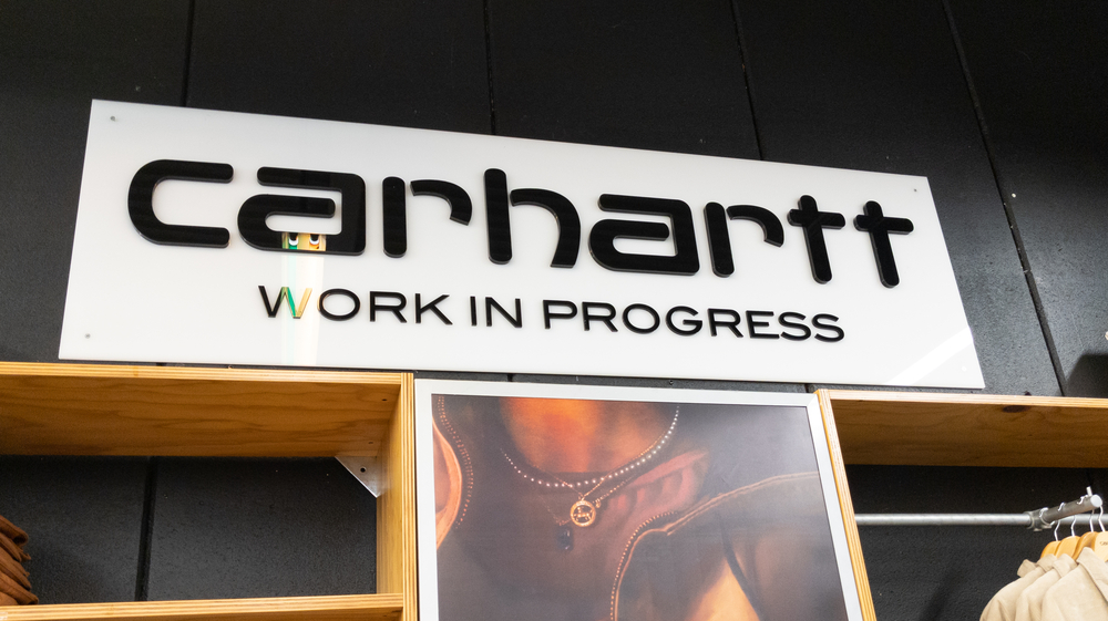
Logos and Images
Add an image or logo if you don’t want to use too many words on your signage. As the old saying goes, a picture can tell a thousand words. In many cases, people will recognize your business from the logo. Additionally, a logo or image can be understood by many types of individuals. You should outline the logo or image with a bold color to make it stand out on your sign.
Another piece of advice is never to overcrowd the sign. The proper letter and image spacing will make it easier to process and read. When words and logos are too close together, they can make the sign unreadable.
Bright Colors
Knowing how color works is crucial to creating the ideal business sign. Think about using bright colors, like red, yellow, or orange, to grab people’s attention. Bright colors will help make your signs stand out. Using light colors, such as pastels, might get lost and be hard to read.
No matter what color you choose, you will want to ensure it works well with the font color and other elements on your signage. Always think about the colors and how they will look and be seen by new potential customers. Like font style and size, selecting the right colors is an essential piece of the process of creating an effective business sign.
Correct Contrasting
Most people will not have time to read the information if your business signage is in a busy area. For that reason, you will want the crucial parts to stand out. Choosing a contrasting background from the font can help with that task. When the background is different from the text color, your audience can read the sign from a comfortable distance. Once again, you will want to work with a professional signage company to choose the right fonts and colors for your sign.
High-Quality Components
All business signs should use high-quality materials to create the signage. When you use poor-quality components, it will reflect in the sign. A low-quality sign will not send the right message to the community. Remember, you want to put your best “foot” forward. If the sign does not look well-made or -designed, it may keep potential customers away from your business.
You also have to think about the cost. While lower-quality signs are cheaper, you will have to replace them faster than those higher-quality signs. Professionally made signs are built to last.
Location
Finally, do not forget about the location of the signage. You want to place it in an area that is easy to spot but still close to your business. With that, your potential customers will connect your business with the sign. Your audience will see thousands of signs every day. For that reason, the location is important. Choosing the right spot will help your signage stand out from the crowd.
Trust Tupp Signs for Your Business Signage
At Tupp Signs, we have the expertise to help you find the perfect signage options for your business, whether a small company or a large corporation. Contact us today to schedule a consultation to help your business stand out from the competition. Call 302-322-1600 to get started on your business signage plans.