
Would you rather have a simple or complicated business sign? While an intricate sign might mean separating yourself from the competition, simple is often the best option. Elaborate signage could cause your business to lose profits and customers. Here are a few things you need to know about signage for your business.
Does Complicated Signage Draw More Customers?
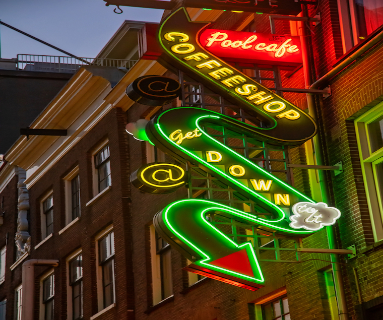
You might think those complicated signs can deliver greater visual appeal, but it does the opposite in many cases. Yes, complex signage can be more attractive than those simple versions, but you can lose some of your brand’s messaging. While complex, information-rich designs are more attractive, they are not always the best for your business.
Providing your customers with too much messaging can lead to a higher cognitive load. In turn, it can drive them away from your business and make the decision-making process more complicated. You may want to use those simple signs when you need to draw clients to your business. With that, you will not overwhelm your viewer with competing walls of texts or colors. Customers will find another service or product when they are overwhelmed. Sometimes, a simple option is the best one for your business.
What’s the Difference Between a Simple and Complicated Sign?
Before you start the sign planning process, how do you keep it simple for your customers? Here are a few ways to uncomplicate signage for your audience.
Select the Best Location
Knowing your audience and location allows you to take the first step in the signage design process. A poor angle, line of sight, or location might mean your audience will never see the sign. Along with that, you don’t want the signage obscured by overgrown bushes or placed in a poor spot. You may miss out on foot and vehicle traffic when you don’t place the signage at the right level.
Choose the Right Size
The wrong size of signage can do more harm than good. If the sign is too small, you will have difficulty attracting traffic and increasing the public awareness of your brand. However, bigger is not always better. If too many elements exist for those massive signs, your audience might ignore your message. Your signage needs to capture a person’s attention in 1.5 seconds. You could lose your audience forever when your customers can’t read the sign because of complicated elements.
Unclutter Text
Why do you use signage? You want to promote your brand and message. No one can read the signage when the text is too small or close together. Customers don’t have time to decipher your text. When they can’t read it, they are more likely to walk away and spend their money elsewhere. You might want to use a large text block to inform customers of special offers, updated products, or new services. Go in another direction with your sign. Instead, focus on your most important announcements. By keeping the text short, you can allow for more room to deliver a concise message.
Use Better Lighting
During the daytime, most signage is easily readable. When the sun goes down, then the readability of your signage might be in trouble. If your business is open at night, you must consider using illuminated signage to entice more customers. Those customers might think you are closed for the night when the signs are not illuminated. Plus, illuminated signage lets you show off the branding and personality of the business.
Even if you are closed, illuminated signage can still help. Potential customers don’t travel past your business only in the daytime. You want an illuminated sign that will show the location of your business and capture the attention of onlookers during the day and night.
Never Use Complex Fonts
If you want to have a consistent and effective look for your branding, use standardized fonts. While you can still use complicated fonts, ensure your message is visible. Any extra layers of complexity will take time for the brain to decipher, leaving many of your customers to walk past the signage. If you want the best visibility and readability, stick with a legible font. Some of the best fonts include Arial, Helvetica, Open Sans, Proxima Nova, and Bebas Neue.
Make Sure the Text and Background Colors Don’t Clash
Color is a vital part of branding. It can communicate your brand’s personality and make your business more receptive to potential customers. Clashing background color and text can make it hard to read your signage. Yes, you can use your brand’s colors but never at the expense of your message.
Stay Away from Visually Similar Signs
Branding is critical for every business. You will want everything to match. When signs look similar, the human brain can filter out redundant information. You want to choose signs that stand out from the surroundings. Select bright colors, unique sizes, and other elements to capture a person’s attention span. Having the same-looking signs can make your signage ineffective, leading to agitated customers, poor brand reception, and lost sales.
With all this in mind, you need the right help to create the ideal signage for your business. At Tupp Signs, we have been in the signage industry since 1928. Our team understands how to create signs that will capture your customers’ attention. From the design to the installation stage, we will work with you every step of the way. Schedule your consultation by calling us at 302-322-1600.