
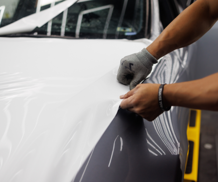
Vehicle wraps are one of the most effective means of advertising in an urban area. The whole idea of advertising is to put “eyes on the product,” and vehicle wraps are a low-cost way to do that. A well-designed wrap will grab the eye and command the attention of any viewer. However, they are only effective when designed correctly. To give you an idea of how that works, let’s look at 5 of the most common mistakes that people make when designing a vehicle wrap.
1. Doing Too Much At Once
It can be tempting to cram a lot of content into your vehicle wrap. You do want to give people a certain amount of information, but it should be limited to the important points. A vehicle wrap should include the name of your business, its primary phone number, maybe an email address, and maybe even a few words about what your company does. The point that we are making is this: Don’t try to cram too much information into one vehicle wrap.
You want people to look at your advertising vehicle and immediately know certain things. You want them to know who you are and what goods or services you offer. They don’t need to know everything. This same logic applies to graphics as well. If you cover the entire vehicle in flashy graphics, it will look “busy” and everything will just get drowned out in a sea of colors and patterns. Remember, it’s a vehicle wrap, not a kaleidoscope.
2. Not Listening To Others
The design of a vehicle wrap is best done as a collaborative project. You only have one chance to get it right, so it helps to have more than one mind on the job. Even if you are very good at designing ads, you should always look for input from others when designing a vehicle wrap. You should also try to get the opinion of a neutral person from the general public because they are the intended audience.
3. Poor Choice of Fonts
This is one of the most common mistakes that we see. All vehicle wraps will have a certain amount of lettering on them, and your choice of font is highly important. Obviously, you wouldn’t want to go with a simple Arial or Times New Roman font for the main logo. Those standard fonts are just too plain. However, if you use a font that is too fancy, the lettering will be hard to read.
Many people will only see this vehicle for a few seconds as it drives by, so they need to be able to read the lettering quickly. Obviously, the size of your letters will also play a role. To figure out the right size, you can use the “10-by-1” rule. The idea is that 1-inch letters will be highly readable from 10 feet away. Thus, 2-inch letters would be easy to read from 20 feet away, and 3-inch letters would be easy to read from 30 feet away.
4. Not Considering The Vehicle Itself
When you design a vehicle wrap, it is very important to consider the shape of the vehicle. You need to identify its most prominent surfaces so that the most important content can be placed there. You also need to identify its least prominent surfaces so that you can leave those as a solid color. You may have to adjust the size of your logos, letters, etc. to fit the size of your vehicle’s most noticeable areas.
With most vehicles, the front and rear doors are excellent display surfaces. They are relatively flat, highly visible, and located near the center of the vehicle when it is viewed from the side. If you want something that will be seen from the front, the hood is really your only good option. For a good rear view, it will depend on the shape of the vehicle. If the back end is relatively flat and “blocky”, it should work very well. If not, you would be better off decorating the rear quarter panels instead.
5. Bad Color Choices
Your choice of colors will be very important to the aesthetics of your wrap. Colors create subtle effects on those who see them, and you should use this to your advantage. Bright colors are usually a good choice, as long as you don’t overuse them. The brightest and most appealing colors should be used for the most important content. In most cases, this will be the name of your business and/or its logo.
You also want to try and choose color combinations that go well together. For instance, don’t go with a mix of yellow and brown. It will make your vehicle look like a rotten banana (or worse). On the other hand, red, blue, and green all mix quite well with one another. Finally, you should choose a color scheme that matches the overall aesthetic of your company.
Conclusion
All of these mistakes are very common, but all of them can be avoided easily. The best way is to employ the services of a qualified signage company that can help you create the best possible wrap. However, no matter what you choose to do, you can avoid a lot of problems by simply avoiding these five pitfalls. If you would like to know more, you can give us a call at 302-322-1600.