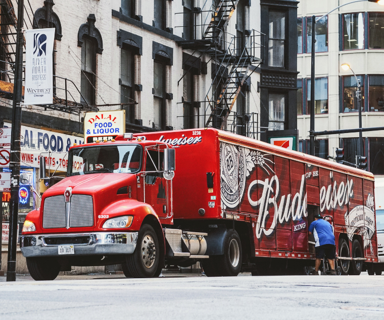
Car wraps are a growing trend in sign advertising, offering your company visibility beyond just a stationary sign along a highway. However, when it comes to creating the perfect car wrap, there are many variables that must be considered. Our pros at Tupp Signs offer a few tips that will help you create the most effective car wrap in order to reach the largest market possible!
Choose Fonts Carefully
There is nothing worse than seeing an advertisement and being unable to read what it says because the font is not legible. Choose a font that can be easily read from a distance, such as Sans Serif or Calibri. Script or handwriting-type fonts are often hard to read, even if they are part of your branding. This is especially true if you are driving down a highway and someone is trying to read what your advertising says quickly.
Establish Hierarchy
A quick glance at other advertising will demonstrate that information is presented in multiple font styles and formats. The most important information is in a larger font, such as your company name and phone number, while other details are in a smaller font. One of the best tips from Tupp Signs is to use two different complementary fonts in order to establish a hierarchy in your advertising. Keep in mind you don’t want to use too many different fonts that could make your ad hard to read.
Graphics Positioning
The font is not the only part of the car wrap you need to pay attention to as your graphics are equally important. If your graphics are not positioned properly, they can actually reduce the benefits of advertising on the car. Make sure that your contact information and business name are prominent, and that any graphics are properly spaced. You also want to keep in mind that a car is not a flat surface like a wall or billboard. You will need to be sure the lettering and graphics are not distorted by door handles, vents, or curves in your vehicle surface.
Prioritize What is Important
Although your graphics and the font you choose are important, the most critical part of your car wrap is your company name and phone number. Because most people will see the wrap when they are driving or walking, they won’t have time to read a long list of text. Avoid adding lists of services on the wrap and focus on the most important things, especially your name and phone number. You want a wrap that makes it easily identifiable as an advertisement for your company. If you want to add services to the wrap, be sure that the font size with your name and phone number is significantly larger than the service information.
Relevant Graphics
Not only do you want to be sure your graphics are placed properly, but you also want to be sure you use graphics that are relevant to your business. If you have a logo with a graphic, that is the only graphic you should use. However, if your logo is lettering, you may want to include images. For instance, if you are advertising a food truck, you want photos of the food you create. If you operate a clothing store, images related to retail clothing are appropriate.
Target Audience
Just like with any advertising, you want to create a car wrap that speaks to your target audience. Who do you hope to reach with the car wrap? You will want to create a demographic that includes ages, personalities, and interests when you create your ad. If you are advertising a food truck, you may want clean, traditional fonts that attract attention while a daycare center may use more playful fonts and graphics.
Text Should Be Limited
It is tempting to put everything possible on a car wrap, but this is not the best use of advertising. If someone simply sees a wall of text on a car, they will likely not stop to take time to read it. If they are driving, they won’t be able to take the time to read it and your ad will become more of a distraction than a true marketing tool. Only use as much text as you absolutely must on the wrap.
Above All, Keep It Simple
The most important thing to do when developing a car wrap for advertising purposes is to keep it as simple as possible. The colors and font you choose are very important, but you really do not need to include a lot of text or even many images. One image is likely enough for a car wrap. Choose a font for your name, phone number, and website that is larger than other fonts in order to make that information stand out when drivers or pedestrians see the vehicle. Overall, the most simplistic car wraps are the most effective.
Get Amazing Business Signs with Tupp Signs
If you are considering a car wrap to advertise your business, Tupp Signs is here to help. We can design the perfect car wrap using the right fonts, perfect images, and just the right amount of text to get you noticed. Contact us today by calling 302-322-1600 or fill out the easy online form to arrange your no-obligation consultation. We will guide you through the entire process and help your business get noticed with a stunning car wrap.


