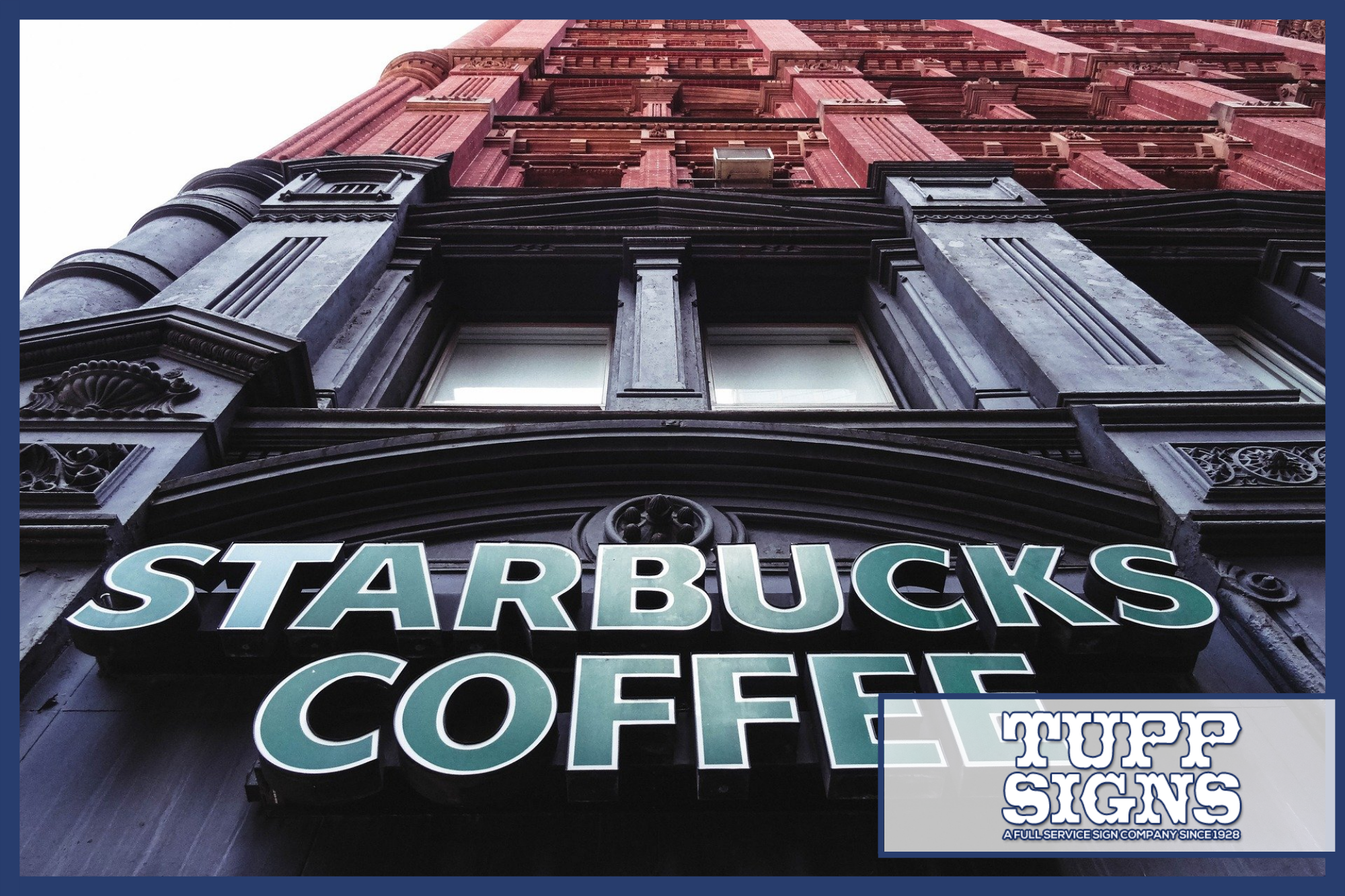
A company’s logo might not be everything that the company is, but it is the beginning. The logo is the touchpoint for customers, just as a book cover is for readers. In other words, maintaining a consistent brand image, and knowing how to apply it to signage is one skill worth mastering. Otherwise, you could be hindering your own marketing efforts.
Here is how you preserve branding on signage:
What is Brand Consistency and Why Does it Matter?
Before we get into the steps for preserving branding on signage, let’s discuss what brand consistency means. Basically, brand consistency is the reason why you imagine the Nike swish or McDonald’s golden arches when you think of that business. It is the reason why an apple makes you think of, well, Apple. Because of such consistency in their marketing and branding, such businesses have become well-known names in their industries. You will also notice that colors, fonts, and logo designs for such brands have hardly changed over the years.
But what does it matter if the logo is a little off? If you change the font every single time you print another temporary sign? Well, it says a couple of things. First, customers might think the company is unstable, because if you can’t decide on a logo, what can you decide on? Worse, it shows inconsistency—the one thing you do not want. Not preserving your brand from sign to sign gives an unhealthy message.
Consistency is Everything
For every sign made, whether it is a directional sign, temporary signs, promotional banners, or something else, the language and imagery should be consistent. Decide early on what your brand colors, fonts, and images are going to be and stick with it. If you need to undergo some rebranding and reorganization to make a clearer brand image for your business, do it. That is one investment you will not feel bad about.
This extends beyond your signage, too. For example, if you have a channel letter sign with your business name in blue and white and futuristic, you probably do not want a website that is pink and flowery. You want to keep your image inline, not leave it disjointed.
Location, Location, Location
Do you operate several branches? If yes, do those businesses all have one cohesive identity? Or has the franchise become less of a unit lately? Businesses with multiple locations have to be even more concerned about the consistency of their signage than places with a single address.
Your customers could visit other locations, and if their experience is not coherent, they will start to feel uneasy. By providing consistent signage with the same design, shape, size, and fonts, they begin to rely on that identity. They will trust it more than places with simply the same name. They will associate the similarities from one location to the next and know what to expect.
Create a Content or Brand Book
One way to ensure that everything made for your brand is going to remain consistent is to utilize a visual guide book. There are different names for it, like the brand book or content guide, but the gist of the guide is to detail the colors, tone, focus, and other interesting facets of your brand.
In the book, you will have things like color schemes, fonts, and phrases that detail your brand image. That way, you can hand the book over to sign designers or content creators to get them to understand your brand’s aesthetic much faster.
Show Off Your Personality, Creatively
Always ask yourself this question about your brand: “Who am I? Who are we?” The answer matters, because it tells you a lot about the personality of your business and brand. There are many characteristics of a brand: quirky, professional, regal, spicy… The options are endless. Think about all the creative methods you have for depicting that personality. You can use logos, colors, and even graphics on your signage to show off your brand identity.
And don’t forget to mix it up. Use permanent and temporary signage, such as seasonal decals and banners, to show off elements of your brand throughout the year.
Conclusion
Brand consistency is essential to gaining customer loyalty. And when it comes to preserving your brand’s image with signage, nothing is more important than providing consistency. Avoid making generic content without any personality, and avoid visual dissonance between locations. Instead, take the time to think about what your brand looks like, what the personality is like, and develop a color scheme that will be used for every sign and location.
Need help figuring out how to develop your business signage? Enlist Tupp Signs! We have an experienced team with plenty of experience and insight into the world of signs. Give us a call or fill out the contact form to learn more.


