
Color has power. The influential shades and hues that are visible to the human eye have a way of setting moods, creating atmosphere, and even shift trends. You have definitely looked into colors when choosing the paint for the walls of your office, storefront, or even in your own home. Therefore, it shouldn’t be surprising that the same concepts you consider when selecting colors for the interior are used for indoor and outdoor signage. After all, signs are just as important as the rest of your business, so you need to choose the correct colors to have an impact on potential customers.
Color Theory & The Meanings Behind Colors
Take a moment to think back to your childhood art classes, where you had a color wheel. On that wheel were the primary colors—red, blue, and yellow. Between those primary colors were the secondary colors, which are made by mixing the primary colors together. Red plus yellow equals orange; blue plus red equals purple, and yellow plus blue equals green. You can even mix primary and secondary colors to develop tertiary colors, like mixing blue and purple to make violet, and so on.
On the wheel, you also have colors that are opposite to one another, which are known as complementary colors. So, blue and orange would be complementary, just like red and green are.
Then you have analogous colors or three colors in a row.
You can also change the “feel” of color by saturating it. Saturation refers to how intense a color is, or how pure it might be. When you reduce the saturation, you lighten the color, making it look washed out. Increasing saturation makes it much darker.
Keep in mind that saturation is neither tinting nor shading. When you tint something, you add white to make it lighter. When you shade a color, you add black.
Color Meanings
Now, when you look at the wheel, you will notice that some colors look purer, more regal, more passionate, or even sadder. Colors are not just imbued with shades and tints and saturation, they also have symbolic meanings that come into play with color theory.
Let’s look at some of the meanings of popular colors:
- Red: Excitement, passion, impulsiveness, rage
- Yellow: Warmth, happiness, sunshine, alertness
- White: Clarity, lucidity, cleanliness, innocence
- Black: Seductive, sophistication, elegance, power, mystery
- Blue: Authority, calmness, productivity, melancholy
- Green: Nature, freedom, wealth, longevity
- Purple: Depth, mystery, royalty, creativity
- Orange: Confidence, aggressiveness, dynamic, adventurous
- Pink: Feminine, romantic, dainty, cute
- Gray: Balanced, utilitarian, mature, stony
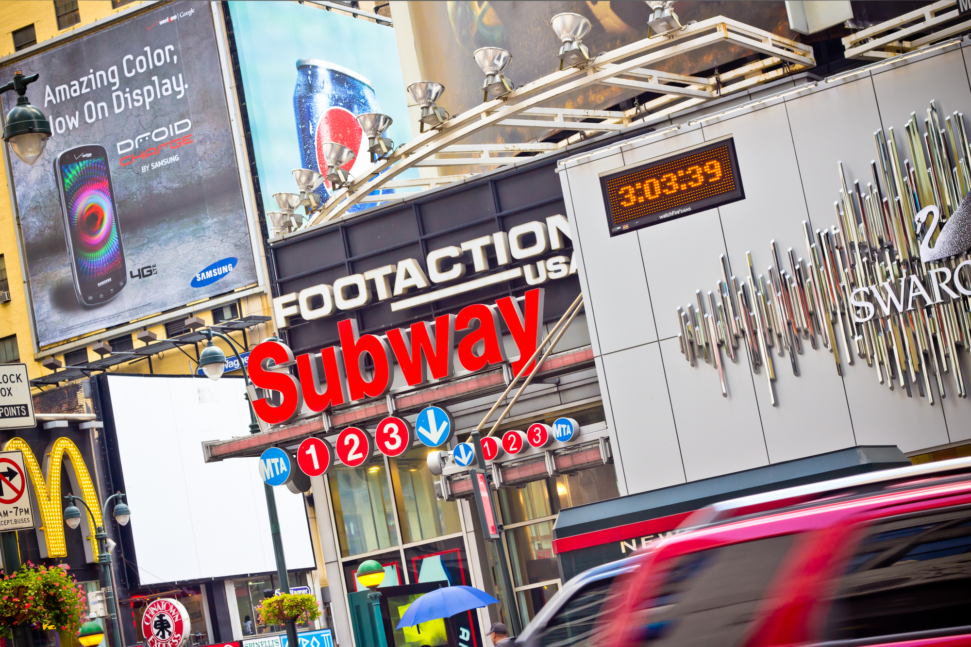
When you want to capture the attention of a passerby, you need to find colors that blend well together without becoming overwhelming. The best method for this is to put contrasting, bright colors together on a sign since that will attract eyes.
Powerful Contrasts
But how do you create the perfect contrast for your sign? Colors can work together or look disjointed. Just check the color wheel if you don’t believe us! Consider color pairings when choosing a sign, since it will not only impact the look of the sign but the visibility. Carefully think of the text and how it looks in the background.
The best legibility for signs seen from a distance is when the color difference is 70-percent or more, which typically comes from coupling darker backgrounds with a lighter text. Here are some examples of decent color combinations for your signage:
- Black backgrounds with yellow, orange, green or white letters
- White backgrounds with gray, red, blue, and black lettering
- Red backgrounds with white or yellow letters
- Yellow background with red, blue, or black lettering
- Light blue background with black or red text
- Gray background with white letters
Notice how you don’t ever consider, for instance, a black background with gray letters or red background with pink text. That wouldn’t be legible, even up close. Remember to consider saturation, tints, and shading, as well.
That said, most people will choose a white background (or shades close to white) for their signage since you can have a contrast with almost any other color on the spectrum. White will rarely clash with other colors, and it looks incredible when illuminated in the evening. However, you don’t have to go with what is popular if you have a specific idea.
Choosing Colors For Your Sign
So, how will you choose? Since different colors will convey meanings to your customers, you need to choose the color that will compliment your logo or business. You want it to deliver a message and do some marketing for you, rather than working against you.
For example, if you are running an eco-friendly company, you might choose a sign with a white background and green and brown lettering to essay a sense of nature, peace, and earthiness. If you run a lingerie store, you will probably choose pinks and reds for your signage. Ultimately, the choice is yours!
Wrapping It Up
Don’t be afraid of colorful, vibrant signage. As long as you stick to colors that tell the story of your brand and don’t deviate from your business’ theme, you will have a sign that looks incredible and attracts customers.
Have questions about signage? Or are you ready to learn more about how we can help you get the signs of your dreams? Then fill out the contact form to get in touch with us!