
We are in an era of information overload, where everything you could ever want to know is at your fingertips or before your very eyes. While it may seem tempting to provide as much information as possible to potential customers, too much text or detail can actually work against your brand’s effectiveness. A well-designed sign should be clear, concise, and visually appealing. When overloaded with information, signage risks becoming cluttered, confusing, and ineffective at capturing attention. Here’s why keeping your signage simple and focused is key to improving readability and boosting customer engagement.
Key Takeaways
- Overloading signs with too much text makes them hard to read and reduces their impact. Keep your message simple and focused.
- A clean, clear sign captures attention quickly and invites curiosity, while cluttered signs can drive customers away.
- Narrow your message to one or two elements to encourage customer engagement and avoid confusion.
- Bold fonts, ample spacing, and a minimal design enhance readability and ensure your message stands out.
- Simple, inviting signage boosts interaction, leading to more social media shares and word-of-mouth promotion.
The Importance of First Impressions
Often, your signage—or an element of it—is the first thing people notice about your business. For instance, someone is driving around and notices your sign above the doorway. Those few seconds of attention are crucial. You need your sign to be able to grab the person’s attention, instill a brief yet poignant message, and then let them be on their way. If your sign is overwhelmed with text or complex details, it can be intimidating or off-putting, leading the customer to walk away without fully understanding what you offer.
By stripping down your message to only the essentials—such as your business name, key service, or an enticing tagline—you allow customers to immediately understand your brand’s value. A clean, clear sign is more likely to draw them in and make them curious enough to learn more.
Legibility Struggles
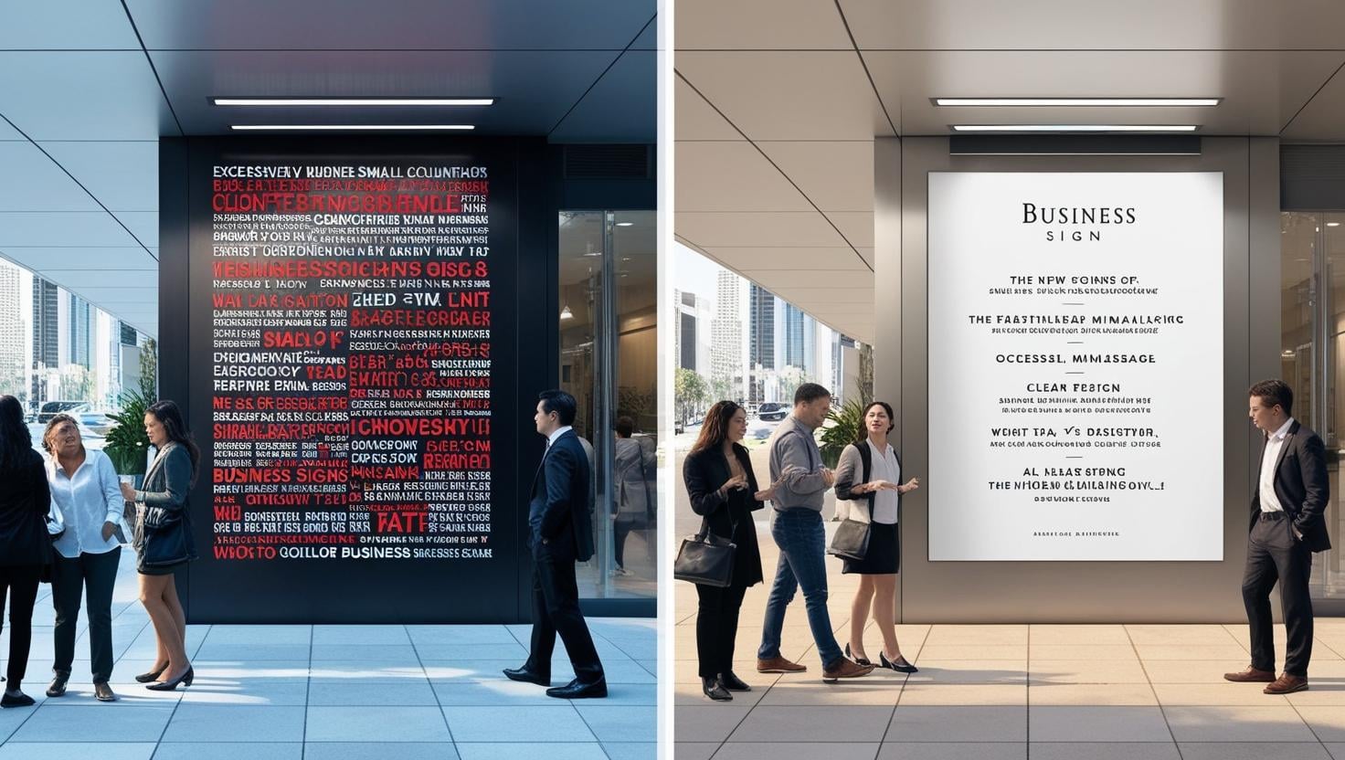
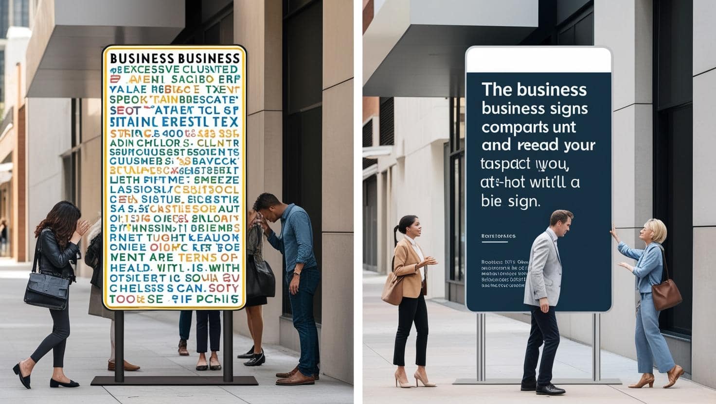
Readability is critical when it comes to an effective sign. Imagine how challenging it is to read anything that is overloaded with small text or crowded with images. Remember, people don’t stop and read every word—they scan and look for easy-to-spot, digestible information. The more crowded your sign, the harder it is for people to pick out the key message. Signs with excessive text become a chore to read, reducing the chances of customers engaging with them. By prioritizing clear and legible fonts, larger text, and a clean layout, you ensure that customers can easily read and understand your message, even from a distance or while in motion.
Reduced Visual Appeal
A legible sign will not only convey the message it’s meant to deliver but also be aesthetically pleasing. When you cram too much into a sign, it will appear cluttered and overwhelming. It will detract from your brand’s overall aesthetic, particularly if you are going for a clean and elegant vibe.
A minimalist design, on the other hand, feels more intentional and aesthetically pleasing. By keeping text to a minimum, you open up space for the design, logo, and branding elements to shine through, reinforcing the image of a high-quality, organized business. In this way, simple signage can contribute significantly to the overall atmosphere and perception of your brand.
Dilution of Key Messages
The core message of your sign should be clear and easily understood. When a sign tries to communicate multiple messages—be it your business’s name, offers, product descriptions, or promotions—it can become confusing for the viewer, leading them to miss the most important information altogether. The more you try to include, the less likely people are to absorb any of it. A clean, focused sign directs the customer’s attention to one key element, whether that’s your business name, a new promotion, or an important call-to-action. By narrowing your message down to what really matters, you create a sign that’s memorable, impactful, and effective at communicating what’s most important to your customers.
Customer Engagement May Suffer
You want signage that sparks curiosity without giving too much away. The simpler and more inviting your sign, the more likely customers are to engage with it. Too much information can make a sign look intimidating or unapproachable, which might deter customers from interacting with it altogether. Clean, concise signage invites customers to take action, whether that’s entering your store, calling for more information, or following your business on social media. Additionally, if your signage is straightforward and easy to digest, people are more likely to engage with it on their own terms—sharing their experience, snapping a photo, or even spreading the word to friends and family.
How to Improve Your Signage
To ensure your signage is both readable and engaging, here are a couple of tips:
- Focus on the essentials: Limit the amount of text to only the most important information, such as your business name, product, or a call to action. Keeping your message concise makes it easy for people to absorb the information in a matter of seconds.
- Use bold, clear fonts: Opt for large, bold fonts that are easy to read from a distance, especially for people who may be walking or driving by your business. Fonts should be clear and legible, avoiding overly intricate designs that might look great up close but are difficult to read from afar.
- Keep the design clean: Simplicity is key to an effective sign. Avoid unnecessary distractions such as excessive graphics, icons, or extra wording that doesn’t directly contribute to your message.
- Limit colors and use contrast: Stick to a limited color palette that aligns with your brand’s visual identity. Ideally, use two or three main colors that work well together to create a harmonious and eye-catching design. Too many colors can compete for attention and make your sign appear cluttered.
- Prioritize spacing: Adequate spacing not only makes the sign more aesthetically pleasing, but it also makes it easier for customers to focus on the key message. Overcrowded signage with text and graphics stacked together can be overwhelming and difficult to digest.
Get Custom Signage from a Local Sign Company Like Tupp Signs
When it comes to business signage, clarity, simplicity, and focus are essential. Too much information can overwhelm potential customers, negatively impacting readability, visual appeal, and engagement. By embracing minimalist design principles, you can create signage that not only attracts attention but also effectively communicates your message. At Tupp Signs, we understand how to create impactful signage that delivers your message clearly and concisely. Contact us today at 866-324-7446 to create signage that enhances your brand and engages your customers.