
We all know that visually appealing signs are better for business. A better-looking sign will always bring more eyes to your premises, which can only be a good thing for you. However, today’s article is not about the importance of captivating signage. More specifically, it is about how you can use captivating signage to enhance your brand. This means making your logo, symbols, and name more noticeable prominent because that is what you want people to remember.
Put The Brand At Center Stage
Every business has something that functions like a logo. For most, it is literally a logo, but some others might use the name of their company in a specialized font. Some others prefer to focus on mascots, like Captain Crunch or the Taco Bell chihuahua. The first thing you need to do is figure out what the symbol of your brand will be.
Whatever you choose, it needs to be front and center in your signage. This is especially true when it comes to your main signs (i.e., the biggest and most prominent ones). Again, you want people to remember that image as if it were burned into their brains. Just like the circus, you always want to put the main act in the center ring.
3-D Lettering Is Very Helpful
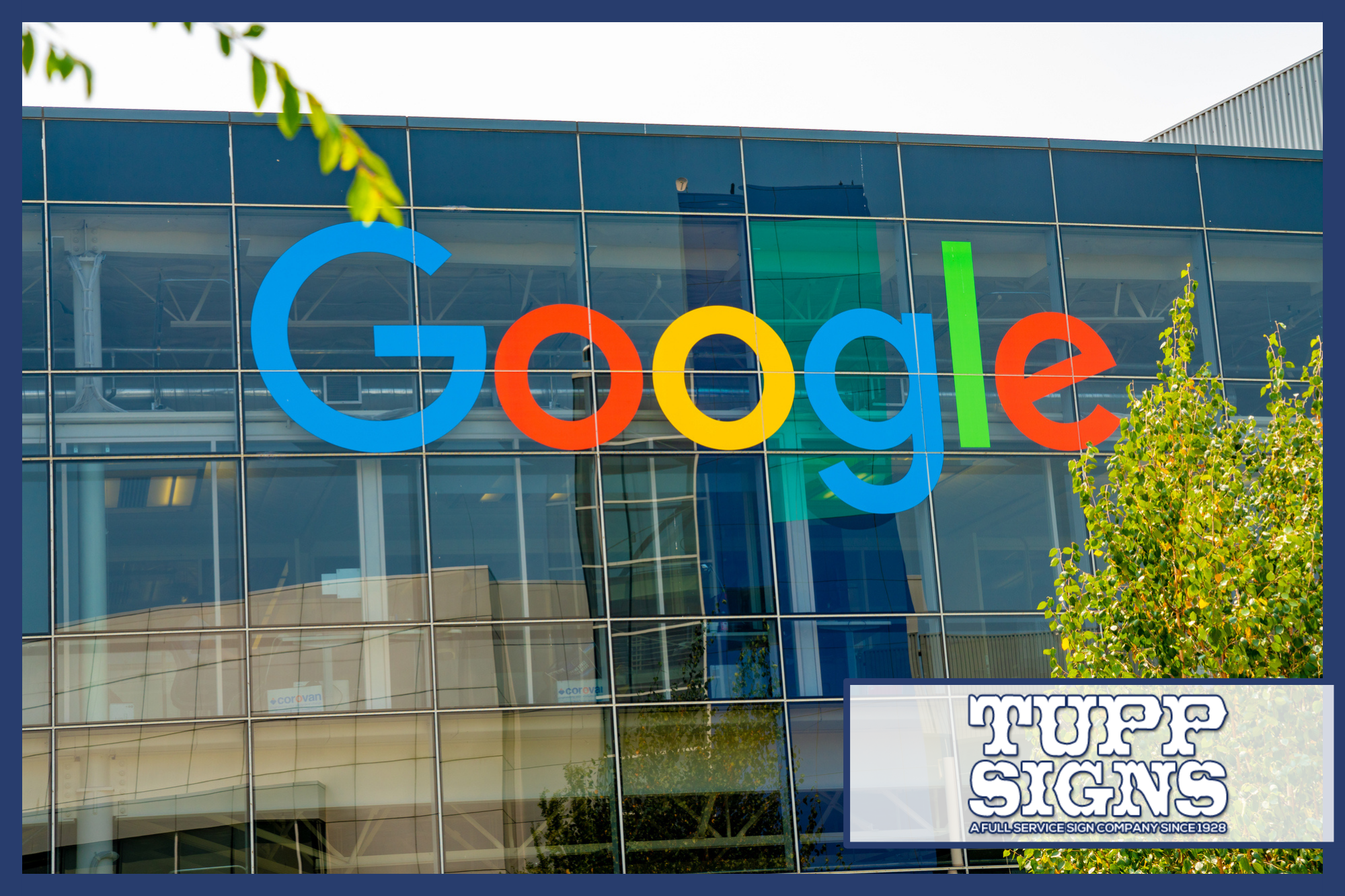
Most logos include lettering in some form or another. This is how it should be, as you want the name of your business to be associated with certain imagery. However, when you are using complex and colorful logos, the lettering can sometimes end up being harder to see. Depending on one’s choice of colors, this problem can end up being much worse. For instance, black letters against a dark blue background or white letters against a yellow one.
In any case, you want the name of your business to pop right out and smack people in the face with its greatness! Obviously, that is a joke, but it’s one that is based on reality. We certainly aren’t telling you to slap your customers and we take no responsibility if you do so. 3-D lettering provides that same effect without anger, black eyes, or potential lawsuits. If you can put some LED lights inside those 3-D letters, so much the better.
Use The Right Color Combinations
We should elaborate a little more about the proper use of colors. Even if you use 3-D lighted lettering for your logo, you should still try to make good use of colors. The idea is to make it so that all your letters are easily read. If you are having trouble with this, all you need to remember is one simple idea: Contrast. Dark colors show up better against a light-colored background, while lighter colors show up better against a dark background.
The following are said to be the most visible color combinations. All of them can be used interchangeably. For instance, white and black go well together, regardless of which one is used for the letters and which one is used for the background.
- Black and white
- Black and yellow
- Dark blue and bright yellow
- Dark green and white
- White and dark blue
- Red and yellow
Choose The Right Fonts
A lot of amateur sign makers will fail to understand the importance of font selection. When a person is typing, they will tend to stick with a small number of common fonts. However, decorative signage is another matter. You don’t want plain and common. On the contrary, you want something that is unique and interesting to the eye.
 At the same time, you have to make sure that customers can read your letters correctly. For instance, the use of “Olde English” lettering can sometimes be a bad call. Although these letters are beautiful, a lot of people have trouble reading them. Unless it matches your particular aesthetic, we would avoid that one. What you want is a perfect balance of fancy and legible. As a side note, your company’s name should be printed in a font that isn’t duplicated anywhere else on the sign. That will make it stand out even more.
Consider A Complete 3-D Logo
Instead of just going with 3-D lettering effects, you could try to make the entire logo “pop” from the sign. This is easier for circular “seal” type logos, but it can be done with any of them. The trick is to use texture as a way to control prominence. The most important parts of the sign (like your business name) should stick out a little farther while the lesser details can be recessed and less visible. Companies that make business signs can easily set you up with this kind of display.
Consider A Hologram Projector
If you really want to make people notice your logo, you could invest in a small hologram projector.
These can be embedded in various types of signs, allowing them to project the logo wherever you choose. For instance, you could have tables in a restaurant with a holographic logo suspended over them. This kind of tech isn’t exactly cheap but it will definitely set you apart from the crowd. Also, small hologram projectors are far more realistic and affordable than larger ones. It might be best to confine this idea to indoor signs as well so that the hardware will not be stolen.
Conclusion
Branding is an essential part of any business marketing strategy. It isn’t just about the idea of making people remember your symbols. On a bigger level, it’s about distinguishing your company in a way that is unique and distinct from all others. Many studies have proven that brand recognition is very important to the long-term success of any company. Thus, we advise all of our customers: Don’t be another placard in a sea of signs. Rather, your signs should demand the attention of all nearby. If you would like to learn more, you can call Tupp Signs at 302-322-1600. If you have been asking yourself: “What are the best business sign companies near me?” then you need look no further.