

It doesn’t matter where your business is located. You need signage that calls attention to your presence and lets people know what you are all about. What kind of signage is flexible enough to capture your unique style while helping you stand out from the competition? The answer is channel letter signs. But how do you design channel letters so they do their job effectively?
Here are some points to help you design your perfect channel letter sign.
Visibility
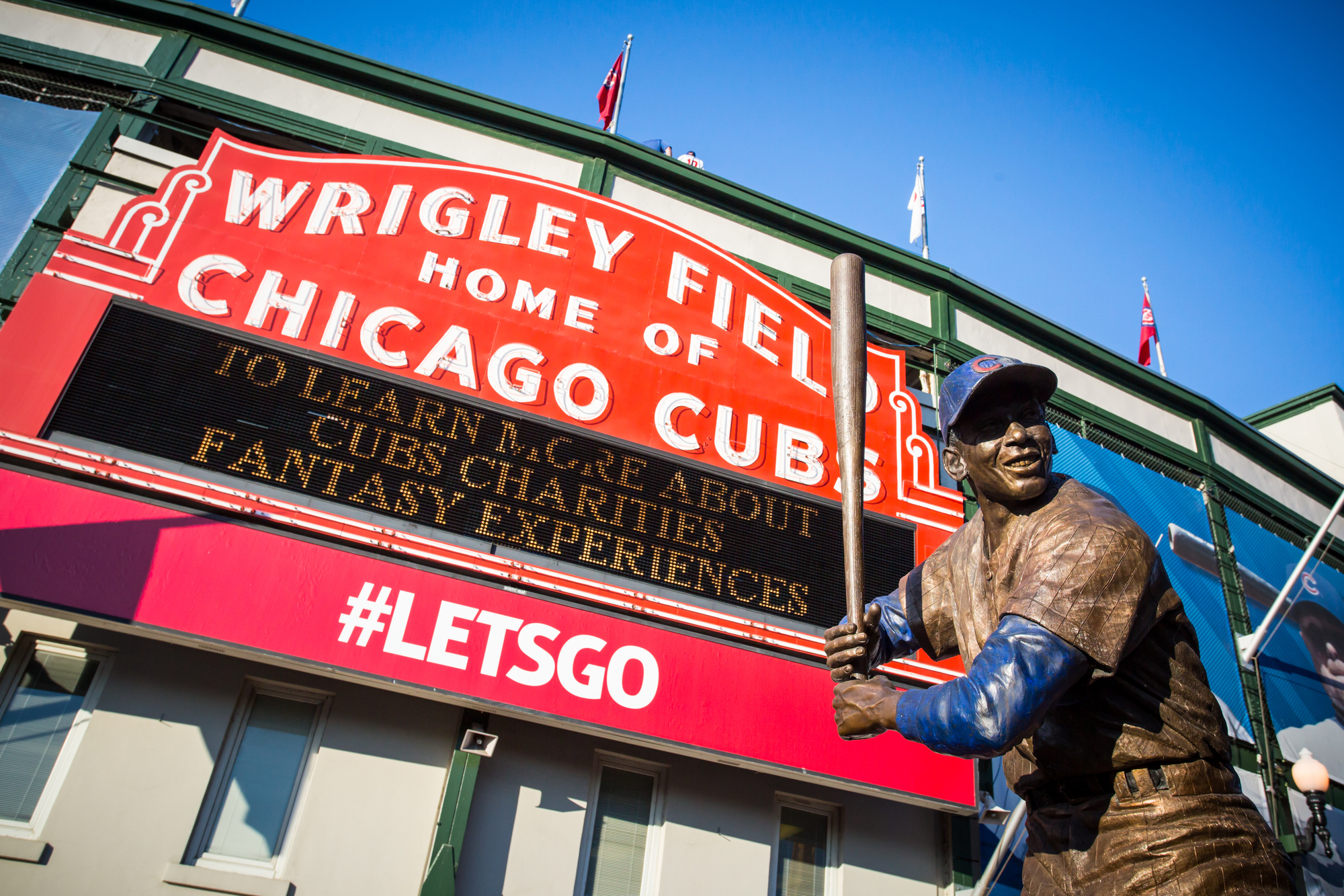
There are a couple of things that go into the visibility of your sign. Foremost would be the font. Depending on the font, the readability of the sign from near and far will change. Complex and stylized fonts, like cursive, will be difficult for people to read, and that can turn them away. You want to choose a bold font that is legible from over a distance.
Also, you want to consider how size plays into visibility. The letters and logo should be big enough to be seen clearly at least 300 feet away.
Colors
Vibrant colors are going to be far more visible than darker ones. However, you don’t want to choose any color willy-nilly, because that can negatively interact with other elements. Consult color psychology and the color wheel for help with selecting colors. It will also help if the colors of the sign reflect your brand. Don’t overlook how certain colors affect various fonts, as well.
Mounts
You can also use the backing, also called the mounting, to customize your channel letter signage. Depending on where you live and where your business is located, there many be some rules you need to follow when it comes to mounting channel letter signage, such as what the color should be or even the style. But if you have the flexibility to decide, you have three options:
- Raceway mounts: Aluminum panels behind the letters that can house electrical components. These can be painted to match the edifice of the building or create a high contrast with the colors and illumination of the channel letters.
- Wireway mounts: Thinner strips of metal where electrical components can be housed. Not usually painted but are less visible than raceway mounts.
- Flush (direct) mounts: The channel letters are mounted directly to the building or structure.
Lighting
Selecting the correct lighting will certainly increase the visibility of your channel letter signage. It can also set the ambiance, especially in the evening. Every lighting option will change the look and feel of your sign, so choose wisely. Here are the four options most sign companies offer:
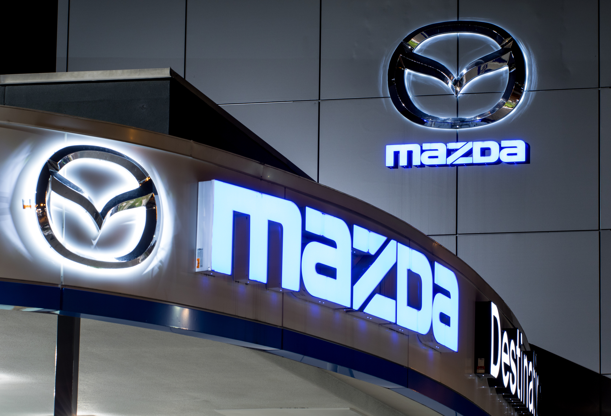
- Front-Lit: The industry standard, featuring aluminum backing and sides with a colored or clear acrylic front (or face). The lighting is either LED or neon and visible directly through the front of the letter.
- Reverse Lit: Also known as halo-lit, this is the opposite of the front-lit style. The face of the letter is solid, and the back is open, allowing the back of the letters to be lit, forming a ring or halo glow around the shapes.
- Front/Back Lit: Add drama with combination lit letters that have lighting both front and back.
- Open Face: Created with aluminum frames but no face, leaving the lighting elements exposed.
Positioning
Most people will have their channel letter signage placed right above the front doors of their business, but sometimes the location of your business or the architecture of the building will not allow for that. You need to consider how the placement will be impacted and also influence the effectiveness of the signage. Poorly positioned letters could limit visibility and comprehension.
What NOT To Do With Channel Letter Signs
Now that you know what goes into designing the perfect channel letter sign, let’s have a look at what you should not do during the planning phase:
- Do not choose a color for your channel letters that match the color of the building. This same principle applies to the mounting surface.
- Do not choose a font that is difficult too read or that is too small. Your sign needs to be both visible and legible from great distances.
- Do not choose all capital letters.
- Do not choose cursive. Use serif fonts.
- Do not create channel letters that have a stroke that is less than 1.5 inches. Strokes need to be at least 1.5 inches for the installation of LED modules or neon tubing.
- Do not place the channel letters in a position where they will not be seen by a passerby or can be misinterpreted.
While it may seem like you need to think about a lot of factors when designing channel letters, rest assured that once you apply these considerations, the rest of the work comes together easily. Channel letters are a very flexible option, so you will be surprised by just how unique you can make your signage.
Ready for show-stopping channel letter signage for your business? Or are you still having trouble deciding how to design your channel letters? Let us help! Fill out the contact form to have a staff member get in touch with you.