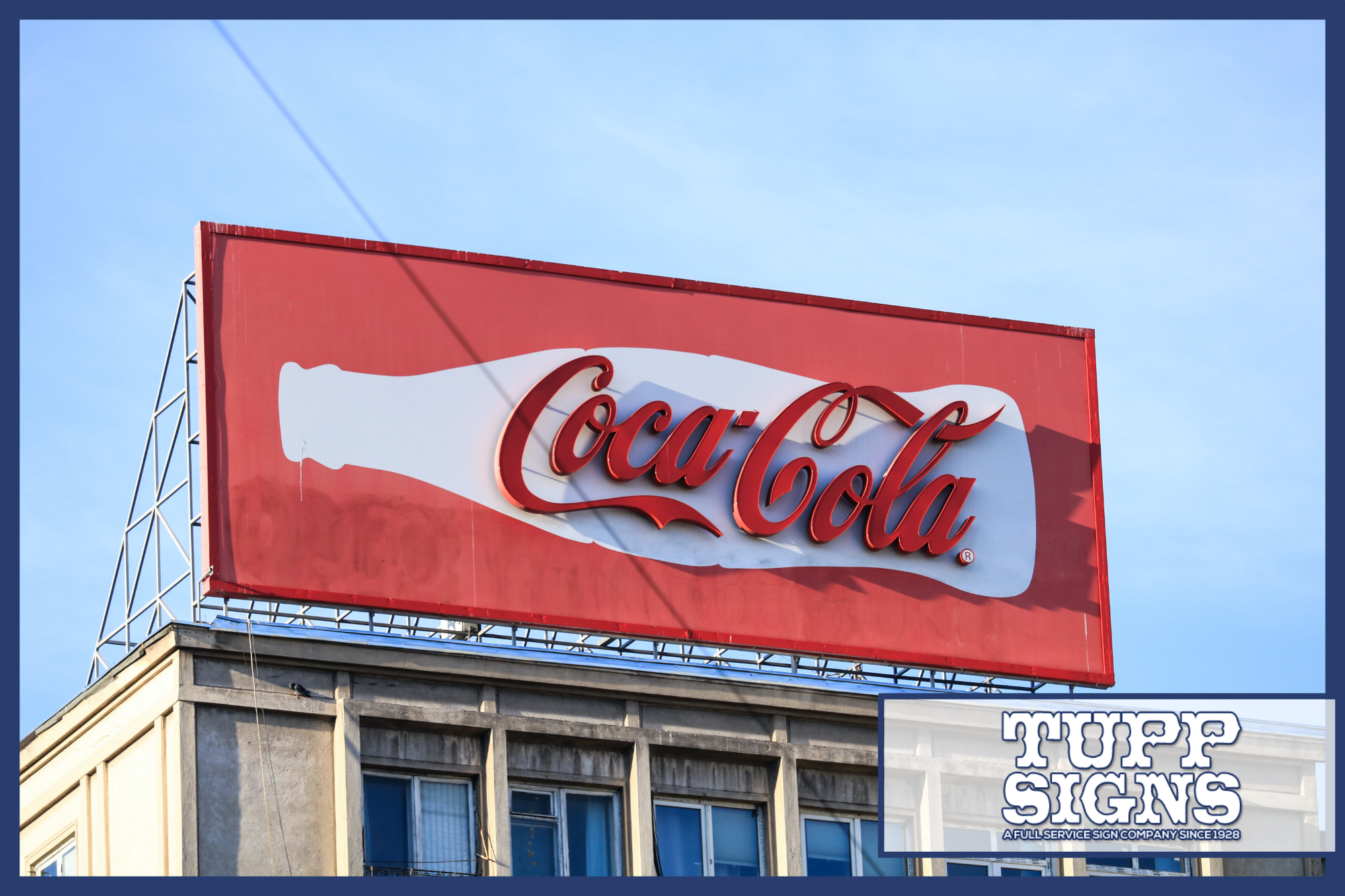
Signage is incredibly important to businesses. Not only does commercial signage show the world who you are and what your business is all about, but it becomes the image that customers affiliate with your services and products. Therefore, you need an effective design that communicates your business’s purpose. You also want to be proud of your signs.
Knowing what goes into commercial signage design, as well as the process of deciding on that final design, will give you an advantage. By the end, you will know how to discuss the designs with a sign expert and come up with something brilliant. Let’s begin.
Steps to Designing Commercial Signage
Before you reach out to a business sign company, you might feel a bit flummoxed by the options. How do you know what kind of commercial signage is right for you? Are the application’s various sign types different? And how do you choose the right design for your business? We won’t say it’s simple, because a bit of thought does go into it. But it does come down to a few steps:
- Consultation
- Designing
- Obtaining Permits
- Construction and Installation
Regardless of which sign company you visit, there will be signage experts who will sit down with you to discuss your options. During this consultation, certain factors will be discussed, such as the type of business, your location, code requirements, installation, and budget.
Once that is out of the way, you can think more about the commercial sign design and its purpose. A physical store is going to need different forms of signage than a showcase or an outdoor event, for instance. The signage expert will also determine the best signage for gaining visibility, including the size, color, shape, and sign style.
You may get several different designs from the sign company before deciding on one that is right for you.
After the design has been approved, the sign company will often move to acquire the correct permits, since the designers need to work closely with the local authorities. Sometimes, you may have to do this yourself. Never skip getting permits and variances, since that could lead to fines.
Then it comes to the fun part: the fabrication. Commercial signage design often requires the use of several machines and technologies, including computerized waterjet machines, welding, screen printing, electrical, paint, laser engraving, and more.
How to Design Attractive Commercial Signage
Let’s get more into the design process. Coming up with a satisfactory design can be complicated if you do it on your own, because there are so many possibilities. Do not get overwhelmed. There is a method to coming up with winning designs:
- Select the right typography. The font sets a tone and says a lot about your business before people even speak to an employee. But regardless of the font style, you need to choose something readable. Avoid complex or too-thin fonts.
- High contrast. The font and background should not blend together. Nor should the sign blend into its location. Go for contrasting colors.
- Make the message simple. If you plan on promoting something, remember this: don’t go overboard. Large, legible font should take up most of the sign, which means you won’t have room to write a novel.
- Choose colors according to your brand image, because color can influence the first impression of your brand. Therefore, you should choose sign colors that support your industry and brand personality.
Considering Where to Install Commercial Signage
The location of the sign is just as important as the way it looks. Your sign is not just decorative. It has a purpose and needs to play its part. This is especially true if you have multiple business locations.
Sometimes, your commercial signage design will have to change depending on the physical location. Consider the locations your businesses inhabit: shopping centers, industrial parks, bustling downtown streets, and so on. Each type of location will require signage that fits that particular location, which means you may need to create a collection of similarly designed signs, or a sign family.
When planning out these sign families (or even just a single commercial sign) and where they are to be placed, consider the following:
- From which direction are people going to see your sign? The orientation of your business can change the optimal positioning of your signage. For example, a business with its own parking lot might need a pylon sign and a cabinet sign, while a business in a shopping center or on the corner of the road is going to need something a bit bolder. Also, consider the type of customer you are attracting. Are they driving? Pedestrians?
- Will the sign need illumination? If so, will the illumination be adequate? For places that receive customers from dawn to dusk or later, illuminated signage will be a boon. Yet, if that sign is not optimally lit or, worse, it is somewhere that the light is muted, it might go unnoticed.
- What are the neighborhood codes and regulations? It is always a good idea to familiarize yourself with the regulations for commercial signage design in your neighborhood. Sometimes, the location, size, and brightness of a sign is controlled by building codes or laws.
Wrapping Up
Armed with these tips, you should now have everything you need to know about commercial signage design. Basically, it comes down to three things: the type of signage you need, the location, and codes and regulations. From there, the design will easily come together.
Looking for an expert signage company? Tupp Signs guarantees a streamlined process and satisfaction. You will get amazing signs, no matter what the purpose. Give us a call or fill out the contact form to get in touch with us. We would love to hear about your next signage project.


