You’ve seen it—the competitor across town has a storefront that just pops. Their sign looks sharp, their branding is on point, and you’re left wondering:
“Why does their signage look more professional than mine?”
It’s a frustrating realization, especially when you know your products or services are just as good—if not better. But here’s the truth: great signage isn’t just about having a sign—it’s about strategic design, premium materials, and brand cohesion.
At Tupp Signs, we help businesses close that gap through end-to-end branding solutions using high-performance materials from Gemini. In this article, we’ll explore what makes signage look truly professional—and how you can level up yours to match (or beat) the competition.
What Makes Signage Look Truly Professional?
Not all signs are created equal. A professional-looking sign does more than display your name—it silently communicates your credibility, quality, and values.
Key Attributes of Professional Signage:
- Cohesive design: Colors, fonts, and logos are consistent with your brand identity.
- High-quality materials: Aluminum, acrylic, or cast metal adds weight and polish.
- Strategic sizing and placement: Designed to be legible and prominent.
- Illumination: Proper lighting enhances visibility day and night.
- Clean fabrication: Sharp edges, clean finishes, and secure mounting show attention to detail.
“Your signage is often your first impression—make it look like you mean business.” – Tupp Signs Design Team
Why Your Competitor’s Signage Stands Out
1. They Invested in Custom Fabrication
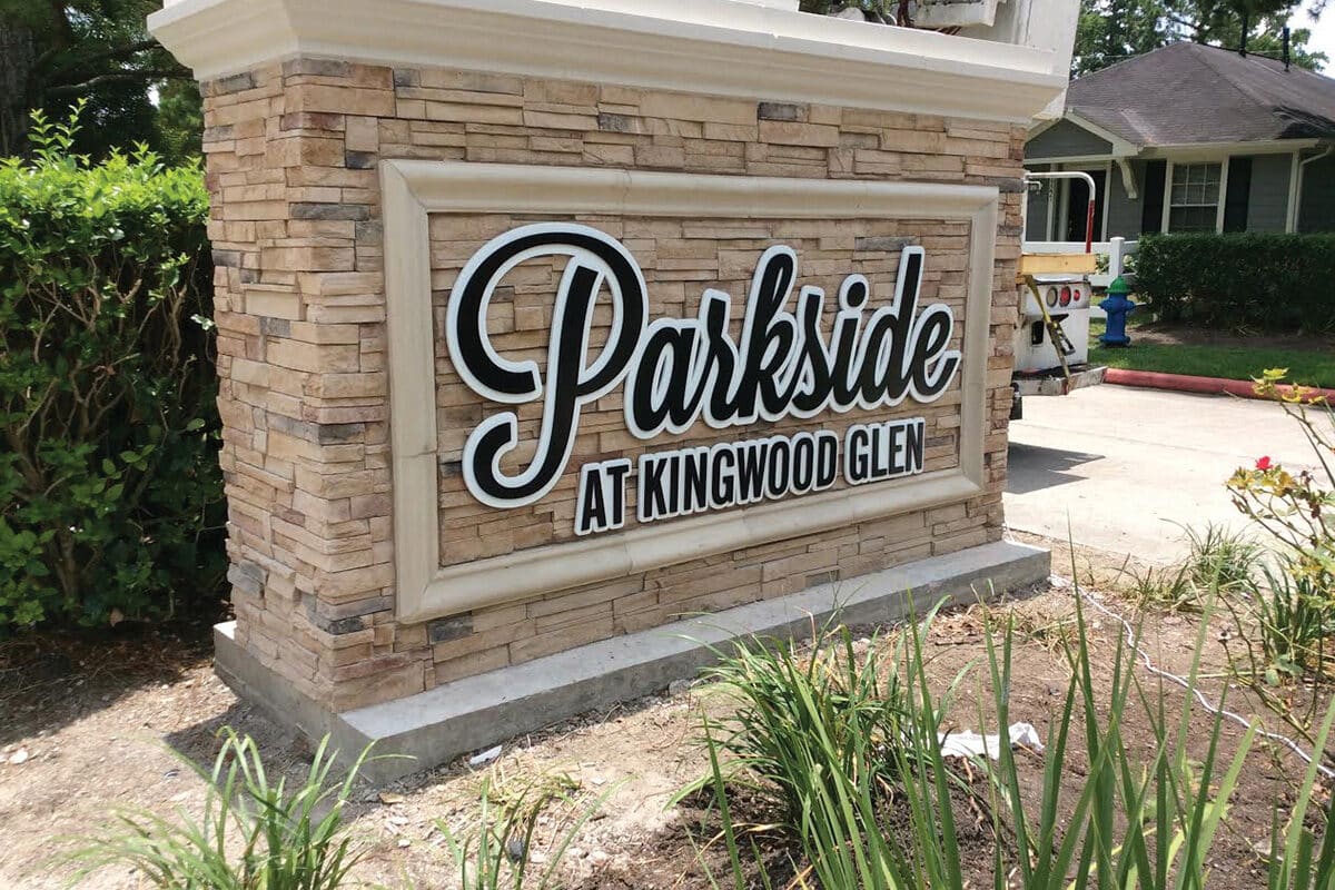
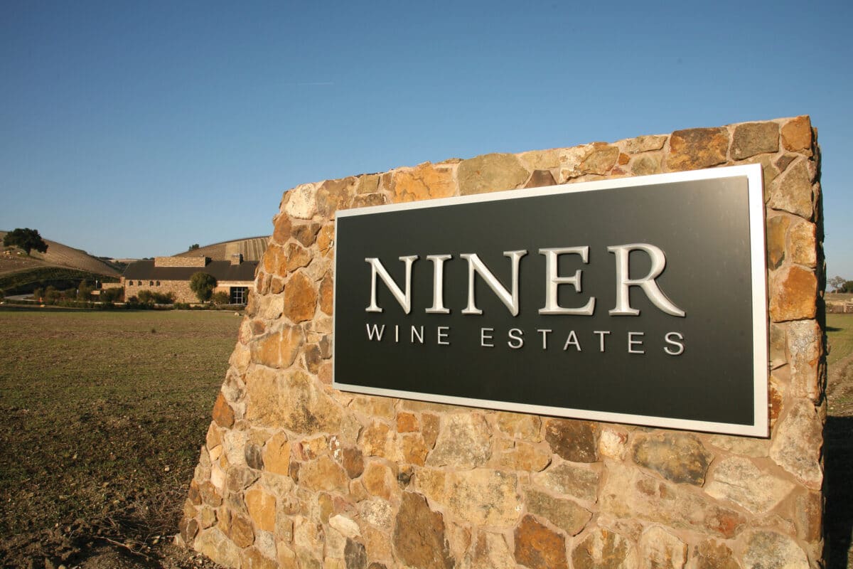
Your competitor likely didn’t go with a budget template—they worked with a sign professional using custom Gemini materials. These signs are fabricated with:
- Brushed aluminum or stainless steel letters
- Painted acrylics with precision-cut designs
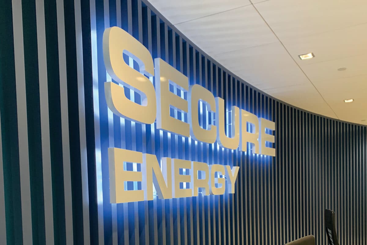
- 3D or halo-lit lettering for added dimension
The result? A sign that feels permanent, polished, and powerful.
2. Their Branding Is Cohesive
Professional signage is never just a sign—it’s part of a brand system. When colors, fonts, and logos are used consistently across signage, storefronts, marketing materials, and online presence, the business appears more established and trustworthy.
3. Their Sign Placement Is Thoughtful
You might be using a sign that’s too small, mounted too high, or lost in architectural shadows. A competitor who works with signage pros has likely optimized placement for:
- Sightlines from passing traffic
- Daytime and nighttime visibility
- Contrast with the building façade
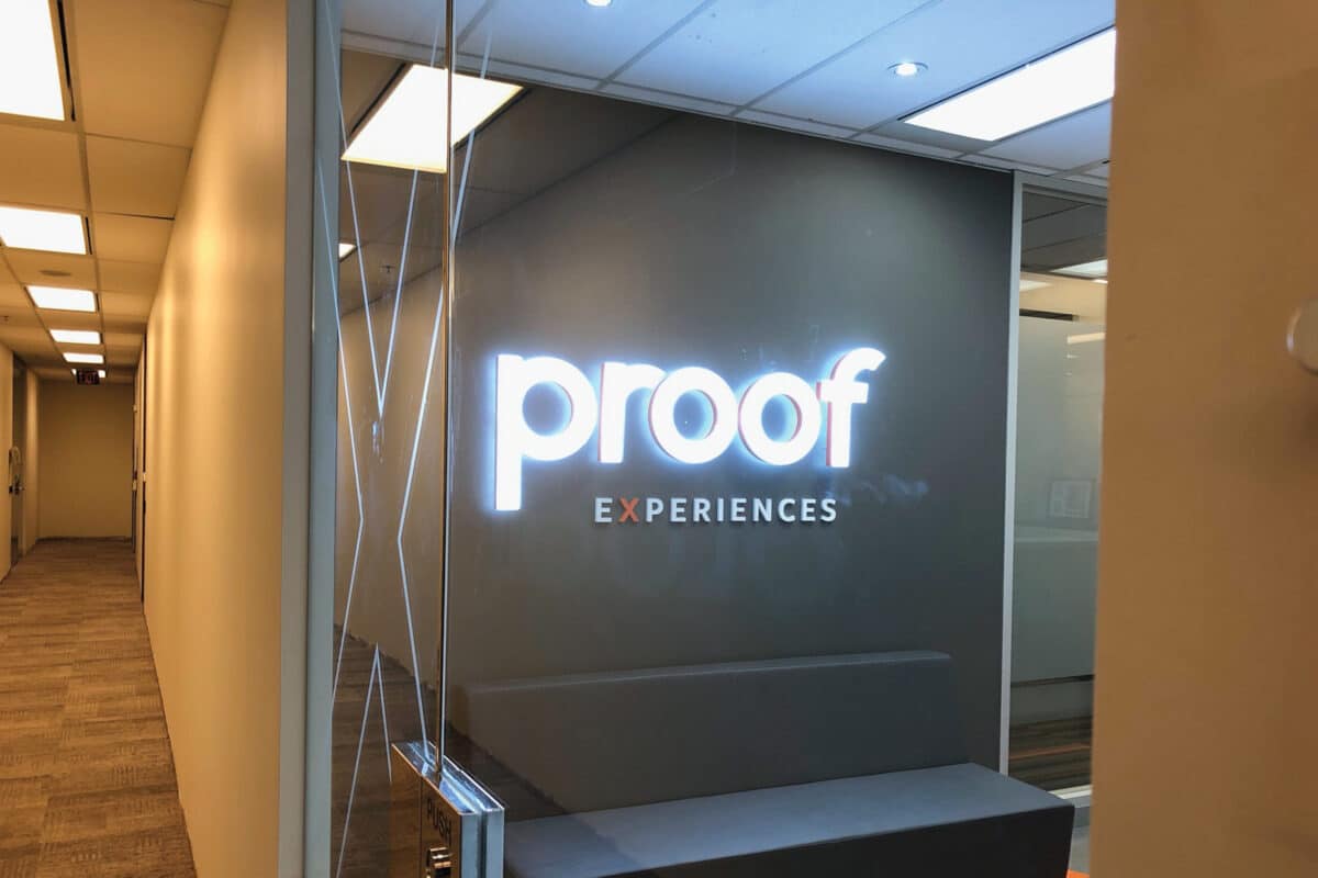
4. Their Sign Uses Better Lighting
Professional signage often features:
- Backlighting or halo-lit effects for elegance and readability
- Internal illumination for all-hours visibility
- Consistent light color and intensity
In contrast, non-illuminated or unevenly lit signs can look dull or dated.
5. They Worked with a Full-Service Signage Partner
Your competitor likely partnered with a company like Tupp Signs, which offers:
- Expert consultation
- Permitting and code compliance
- Custom fabrication through Gemini
- Professional installation and maintenance
Solution: End-to-End Branding With Gemini Materials via Tupp Signs
We help businesses close the professionalism gap by delivering signage solutions built on brand alignment, craftsmanship, and premium materials.
1. Design and Consultation
Our process begins with a deep dive into your brand:
- What do you want your signage to communicate?
- Who are your ideal customers?
- What visual elements define your identity?
We turn these insights into clear, impactful signage concepts.
2. Fabrication with Gemini Materials
We use Gemini’s best-in-class signage materials, which include:
- Metal and acrylic dimensional letters
- Durable plaques and custom logo signs
- Painted or brushed finishes matched to your branding
- Mounting systems suited to any environment or wall type
Gemini products are built to last and engineered for aesthetics, ensuring your signage holds up to scrutiny—and the elements.
3. Turnkey Project Management
From permitting to installation, we handle it all:
- Code-compliant designs for your local jurisdiction
- Seamless coordination with property managers and landlords
- Professional installation with exacting detail
Real-World Example: A Brand Elevation Success
Client: Independent Financial Services Firm
Problem: Basic flat panel sign made the business look less professional than national competitors.
Solution:
- Designed new branding package with dimensional Gemini letters
- Added a halo-lit feature and matte black aluminum backdrop
- Installed new signage with improved visibility and branding consistency
Outcome:
- 2x increase in new client inquiries
- Clients reported greater confidence in the firm’s credibility
- Competitors took notice and commented on the upgrade
Conclusion
If your competitor’s signage looks more professional, it’s not luck—it’s strategy and execution. And now, you can have the same (or better) tools at your disposal.
By partnering with Tupp Signs and leveraging Gemini’s premium materials, you can transform your signage from overlooked to unforgettable—and show the world you mean business.
📞 Ready to close the gap and elevate your brand presence?
Contact Tupp Signs today for a signage consultation. We’ll show you how professional design, premium materials, and cohesive branding can give your business the standout signage it deserves.