
Have you ever watched a visitor wander through your office complex—lost, frustrated, and visibly stressed? It’s not a great look for your business.
Your space may be beautiful and professionally designed, but if people can’t find where they’re going, it undermines your image and efficiency. Helping visitors navigate your office complex is more than a courtesy—it’s a strategic move that improves first impressions, boosts accessibility, and reflects your company’s attention to detail.
This article breaks down the best practices and innovative solutions for creating a seamless visitor experience. Whether you’re managing a corporate headquarters, a medical office building, or a multi-tenant complex, these tips will help you guide guests with confidence and style.
Understand Your Office Complex Layout
Start With a Site Survey
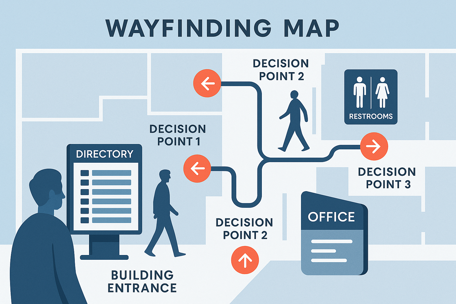
Before you invest in signs, tech, or apps, take a walk through your building. Observe how people move through the space. Where do they hesitate? Where do they get turned around?
A professional site survey and traffic flow analysis will help you:
- Identify key decision points (entrances, elevators, intersections)
- Spot bottlenecks or poorly marked areas
- Map zones such as departments, floors, and amenities

Use Clear and Strategic Wayfinding Signage
Directory Signs
Place these at primary entrances, lobbies, and elevator bays. They should include:
- Tenant or department names
- Floor numbers and color-coded zones
- Arrows or paths to key locations
Directional Signs
These guide users between spaces:
- Wall-mounted or hanging signs with clear, high-contrast text
- Use consistent naming conventions and arrows
- Include icons for universal understanding (restrooms, stairs, conference rooms)
Office Identifiers and ADA Compliance
Individual rooms and offices should feature:
- Door signs with names or numbers
- ADA-compliant signage with tactile letters and braille
- Non-glare materials and proper contrast
Emergency Signage
Never overlook:
- Exit signs and evacuation maps
- Signs indicating AEDs, fire extinguishers, or shelters
Integrate Digital and Modular Signage for Flexibility
Digital Directories
Install interactive screens in high-traffic areas to:
- Display tenant directories with search features
- Offer real-time updates on room availability
- Share branding messages or announcements
Modular Sign Systems
Perfect for offices that experience frequent change:
- Swap out names, titles, or room numbers with ease
- Maintain brand consistency while staying adaptable
QR Codes and Mobile Integration
Consider mobile-friendly solutions:
- QR codes linking to building maps or meeting room directions
- Custom mobile apps for larger complexes
Pro Tip: Pair static signage with digital options to enhance flexibility without losing design cohesion.
Enhance the Visitor Experience with Branding
Wayfinding isn’t just functional—it’s an extension of your brand.
- Use brand colors, fonts, and logos across signage
- Incorporate environmental graphics—murals, wall vinyls, or dimensional lettering—to create a cohesive feel
- Ensure your signs reflect your brand tone: polished and corporate? Playful and creative?
Train Staff and Use Complementary Tools
Even with the best signage, human interaction matters.
Reception and Security
- Ensure front desk staff are trained to direct visitors
- Provide branded visitor badges with wayfinding info printed on them
Printed Maps and Digital Guides
- Offer easy-to-read maps at the entrance
- Include wayfinding info in meeting invites or welcome emails
Mobile Wayfinding Tools
- Consider building-specific apps or web-based tools for larger or multi-building campuses

Case Study: Corporate Headquarters Navigation Overhaul
Challenge: A financial services firm in Delaware received frequent complaints about confusing navigation in their three-building campus.
Solution: Tupp Signs conducted a site audit and implemented a branded modular wayfinding signage system featuring:
- Color-coded zones for each building
- Digital directories with search functions
- ADA-compliant office signs
Results:
- 40% drop in visitor complaints
- Enhanced tenant satisfaction
- Reduced reception desk inquiries
Work with Experts for Custom Sign Solutions
Navigating signage design, compliance, and installation can be overwhelming. That’s where we come in.
At Tupp Signs, we specialize in:
- Custom office signage systems
- Professional signage planning
- ADA-compliant installations
- Turnkey project management from site surveys to post-installation support
We’ve helped businesses across the Northeast transform their spaces into intuitive, welcoming environments that reflect their professionalism and brand.
Conclusion
Helping visitors navigate your office complex isn’t just about putting up signs. It’s about designing an experience—one that’s clear, welcoming, and aligned with your brand values.
From building directory signage to ADA wayfinding systems, the right approach can turn confusion into confidence and elevate your entire environment.
📞 Ready to upgrade your office navigation?
Contact Tupp Signs today for a site survey or to request a custom signage consultation.
Let’s make your office complex easy to navigate—and impossible to forget.