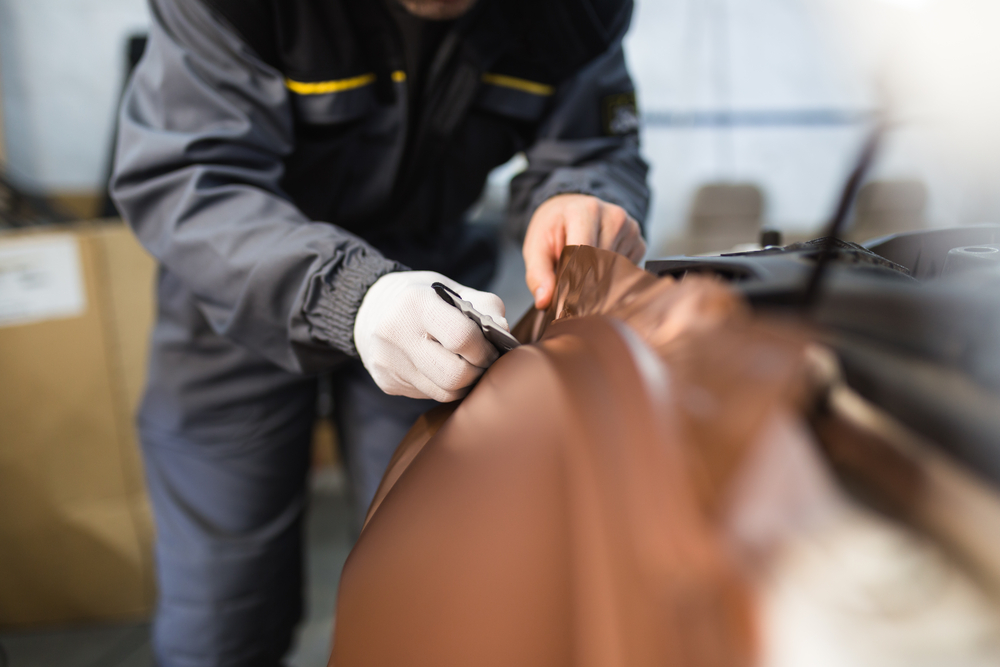
People spend a lot of time in the car, so much time that most barely think anything of it. But that doesn’t mean you can’t take advantage of those hours commuting. With a vehicle wrap on your personal or company car, you can market your business effectively and effortlessly. In fact, a vehicle wrap can get between 30,000 and 70,000 impressions a day.
Even if people aren’t actively looking at the information, the more they see your business name and logo, the greater the chance they turn to you when they need your services.
Sounds amazing, right? Ready to get wrapping? Best take a moment to learn what not to do with a vehicle wrap. You’ll get more out of it that way.
6 Do’s and Don’ts of Vehicle Wraps
By not rushing in on a whim, you’ve already evaded some costly mistakes. Now, here are six things to keep in mind when you go get your vehicle wrap designed:
1. Do be bold. Make a statement!
It’s easy to get too excited and overwhelmed by the possibilities that you retract your creativity and end up with something the exact opposite. A boring vehicle wrap is going to do worse for you than one that is eye-catching. Think of your current vehicle as a blank canvas. Imagine how the colors, images, and lettering will look on the contours.
Be bold and daring, not boring. Choose those bright colors, bold fonts, and professionally photographed images.
And don’t worry, we’ll explain how to not go overboard in the next few points.
2. Don’t overload. Keep it simple.
Yes, you should be as bold as possible, but you also want to avoid clutter. Try to keep the information on the vehicle basic: the name of your business, social media handles, and contact information.
If you have strong branding, your business name, logo, colors, and fonts will say more with less. The key is using those graphics well.
For example, if Starbucks had a food truck, it would be green and black with the logo on each side. You would know immediately what that truck was selling without needing it to say “hot coffee” everywhere.
3. Do use an easily readable font.
One mistake that many businesses make with signage and prints is legibility—or the lack thereof. Just because a font looks gorgeous up close, it doesn’t mean that it will be readable from afar. And when you’re driving around the company vehicle, it’s going to be even more difficult for people to see.
Great font choices include Helvetica, Futura, Myriad, Garamond, Optima, Bodoni, Calibri, Proxima Nova, and Avenir. If none of those suit you, talk with a professional designer, as they might have alternatives.
4. Don’t use low-quality images.
When you send the sign company your images for the vehicle wrap, please don’t send them a low quality stock photo or something from your phone. Yes, those images look good on Instagram, but when the picture is resized to meet the dimensions of your car, it will look fuzzy or grainy and—unfortunately–very unprofessional.
You’re advertising your brand. Don’t let low quality images reflect poorly on what you do. Instead, invest in a professional photographer.
5. Do present your brand thoughtfully.
This one is the most important to remember. Whether you plan on fully wrapping your vehicle or getting some vinyl details, branding is what matters most. Make sure the design is attuned to your branding.
Use the same branding and information that you would for other marketing materials. Choose colors and graphics that support your branding. For example, if you run a catering business, you would use imagery or a logo related to the industry.
And remember what and where you are trying to promote. If you have a residential lawn care business, the energy should be friendly and colorful. Conversely, a commercial landscaping business would be no-nonsense and sophisticated.
On that note, remember to also keep your vehicle clean while it’s wrapped. Driving around with mud and dirt on your brand name is only going to impact how people perceive your brand.
6. Don’t advertise on just one side.
Your vehicle is a three-dimensional object with two sides and a rear to use for advertisements. Don’t make the mistake of putting information on one side or the other. Secondly, consider those dimensions. What looks good on the sides might not suit the rear. You should be able to clearly see contact information on each side.
Next, if you have a fleet of differently sized vehicles, you should know that vehicle wraps are not one-size-fits-all. Know how different elements of the design are going to lay on bumpers, doors, and windows. Some states don’t allow for wraps to cover the windows, for instance.
Get a Beautiful Vehicle Wrap at Tupp Signs
Wrapping your car or truck with a vibrant and bold wrap is definitely a smart move. Like signage, a vehicle wrap is one branding venture with high ROI. Now that you know what goes into a winning design, it’s time to make it a reality. At Tupp Signs, our professional team can help you bring your ideas to fruition, so you’ll have that stunning custom wrap in no time. Give us a call today to get started.


