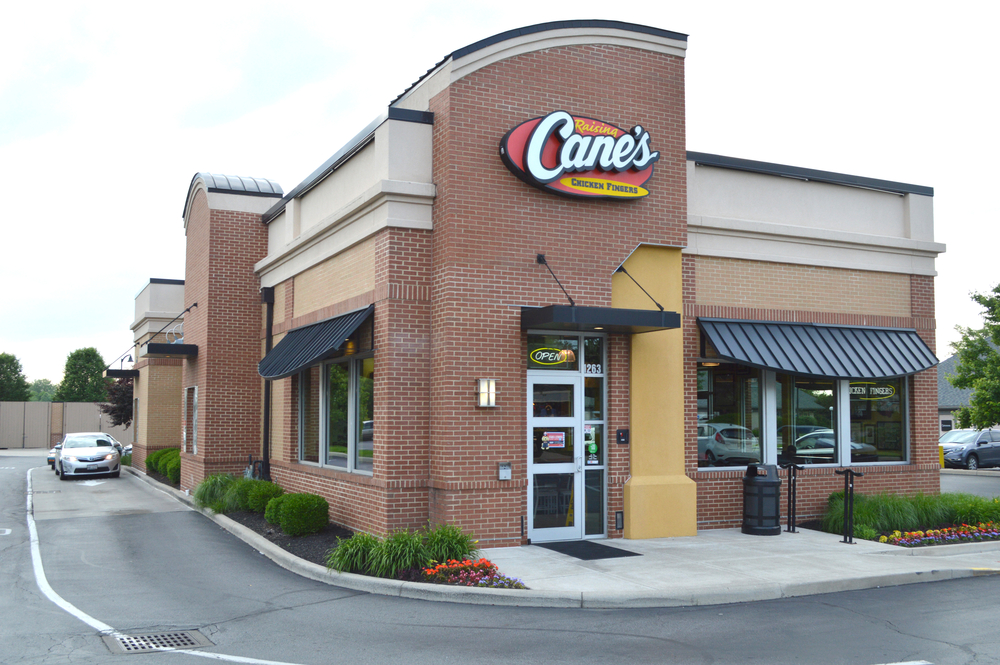
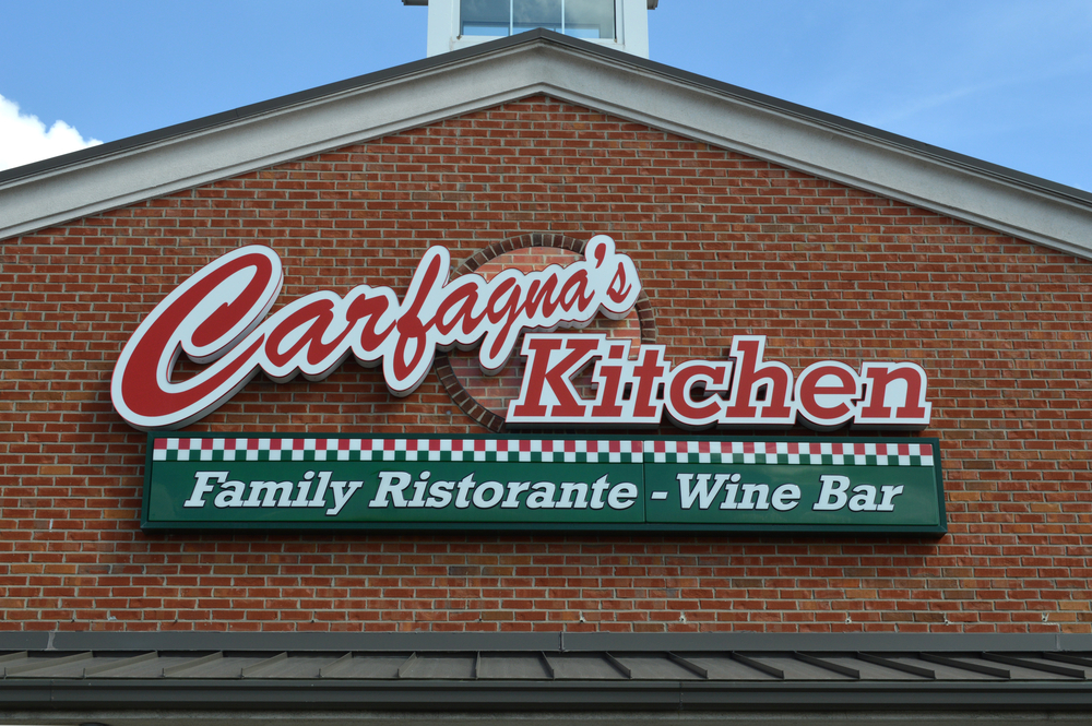
Did you know signage can be the difference between a forgettable building and a landmark? Signage is often seen as a mere necessity – a way to identify a building or provide basic information. But what if we told you it can be much more? Strategic signage is a powerful design tool that can enhance your building’s aesthetics, strengthen your brand identity, and create a memorable experience for visitors. This comprehensive guide is designed for architects, business owners, property managers, and anyone who wants to unlock the full potential of signage as a design element.
Signage for Different Business Types: A Comparison
This table offers a quick comparison of how signage strategies can differ across various business types:
| Business Type | Key Signage Focus | Signage Example |
| Restaurant | Brand identity, Menu display, Daily specials | Full-color LED message center showcasing mouthwatering food images and daily specials. |
| Retail Store | Brand awareness, Promotions, Sales announcements | Sleek, double-sided digital display mounted outside the store, featuring a clothing sale with discount codes. |
| Bank | Information delivery, Brand credibility, Upcoming events | Multi-line LED message center displaying current interest rates and announcing financial workshops. |
| Museum | Brand storytelling, Historical references, Wayfinding | Sleek, minimalist sign featuring the museum’s logo and name, alongside historical references incorporated into wayfinding signage. |
Beyond the Basics: Signage as a Design Tool
Signage goes far beyond simply conveying information. Imagine a sleek, modern building adorned with minimalist signage that perfectly complements its clean lines. Or picture a historic building featuring handcrafted signs that echo its architectural details. Effective signage can seamlessly integrate with your building’s style, creating a cohesive and visually appealing whole.
But functionality is crucial as well. A well-designed signage system establishes a clear hierarchy, guiding visitors effortlessly through your space. Building identification signs make a strong first impression, while directional signs ensure smooth navigation. Informative signs deliver essential details without overwhelming viewers with text.

The Power of Choice: Material and Color Selection
The materials and colors you choose for your signage significantly impact the overall design. Natural materials like wood or stone lend a rustic charm, while sleek metals or glass exude a modern vibe. Consider factors like durability, visibility in your environment, and maintenance requirements.
Color is a powerful design tool. Bold colors can grab attention and create a dynamic presence, while more subdued tones can evoke a sense of sophistication. The colors you choose should complement your brand identity and the overall aesthetic of your building.
Lighting Up Your Design: Lighting and Technology Integration
Don’t underestimate the power of lighting! Backlighting can elevate your signage, making it visible even at night. Strategic lighting placement can create a dramatic effect and enhance the overall visual impact. For a truly modern touch, consider incorporating digital signage. Digital displays offer dynamic content capabilities, allowing you to showcase real-time information, eye-catching visuals, and even interactive experiences.

Signage for Different Purposes: Tailoring Your Approach
Now that you understand the power of signage as a design element, let’s explore how to tailor it for specific purposes:
Building Identification: Be Bold and Be Seen
Your building’s identification sign is its first impression. Make it count with these tips:
- Logo Integration: Prominently feature your logo to establish brand recognition. Ensure the logo is clear, legible, and reflects your brand identity.
- Clear Typography: Choose easy-to-read fonts that are visible from a distance. Avoid overly decorative or script fonts that can be difficult to decipher.
- Appropriate Scale: The sign should be large enough to be easily seen from the street or main entrance. However, avoid overwhelming the building’s facade. Maintain a balanced and proportional relationship between the sign and the building itself.
Directional Signage: Guide Them Like a Pro
A well-designed directional signage system helps visitors navigate your space effortlessly. Here’s how:
- Pictograms: Utilize universally understood pictograms to convey directions without relying solely on text. This is particularly helpful for visitors with different language backgrounds.
- Consistent Layout: Maintain a consistent layout and design style for all directional signs. This creates a sense of familiarity and makes it easier for visitors to understand the information presented.
- Proper Placement: Strategically place signs at key decision points, such as entrances, hallways, and intersections. Ensure they are positioned at an appropriate height for clear visibility.
Informative Signage: Keep it Clear and Concise
Informative signs convey essential details but shouldn’t overwhelm viewers. Here’s how to strike the right balance:
- Concise Text: Stick to the point. Use clear and concise language that is easy to understand.
- Use of Icons: Incorporate icons or symbols to reinforce the message and enhance visual clarity.
- Appropriate Font Size: Choose a font size large enough to be read comfortably from the intended viewing distance. Consider including braille or raised lettering for accessibility.

Creating a Cohesive Signage System: A Step-by-Step Guide
A cohesive signage system creates a unified visual language for your building. Here’s a roadmap to achieve it:
-
Define Your Goals:
Before diving into design, establish clear goals for your signage system. Do you want to prioritize brand awareness, ensure smooth wayfinding, or comply with specific regulations? Identifying these goals will guide your design decisions.
-
Target Audience Consideration:
Who are you designing for? Consider your target audience’s age group, cultural background, and familiarity with the location. This will influence the level of detail needed and the choice of language and icons.
-
Inventory and Assessment:
Take stock of existing signage. Evaluate its effectiveness, identify areas for improvement, and determine if any signs can be repurposed or integrated into the new system.
-
Design and Material Selection:
Work with a sign designer to create a cohesive visual style for your signage system. Consider factors like budget, brand identity, and local regulations regarding size, placement, and illumination. Choose materials that complement your building’s architecture and are durable enough to withstand the elements.
-
Professional Installation and Maintenance:
Professional installation ensures safety and proper functionality. A reputable sign company will handle mounting, electrical connections, and compliance with safety regulations. Regular cleaning and maintenance will keep your signage looking its best and ensure optimal performance for years to come.
By following these steps and tailoring your signage for specific purposes, you can create a system that is both functional and aesthetically pleasing. In the next section, we’ll explore the power of signage beyond functionality and delve into its potential to create a lasting emotional impact.
View this post on Instagram
Beyond Functionality: The Emotional Impact of Signage
Signage transcends mere information delivery. It can be a powerful storytelling tool, shaping the emotional experience of visitors and fostering a connection with your brand.
Signage and Brand Storytelling:
Imagine a museum incorporating historical references or vintage typography into their signage, transporting visitors back in time. A restaurant might showcase hand-painted murals or artistic lettering on their menu boards, reflecting their unique culinary philosophy. Interactive displays can engage visitors, allowing them to explore information in a fun and dynamic way. By weaving storytelling elements into your signage, you create a memorable experience that goes beyond simply conveying basic details.
Signage and Community Building:
Signage can also play a subtle but significant role in building a sense of community. Well-designed signage systems that are clear, informative, and welcoming create a sense of belonging and inclusivity. Artistic elements or culturally relevant design choices can resonate with local residents and contribute to the overall character of a neighborhood. Signage can act as a bridge, fostering connections between visitors and the space they inhabit.
Conclusion: A Signed Success Story
By strategically leveraging signage as a design element, you can achieve a multitude of benefits:
- Enhanced Brand Identity: Signage reinforces your brand image and creates a lasting impression on visitors.
- Improved Wayfinding: A clear and cohesive signage system ensures effortless navigation for visitors.
- Elevated Aesthetics: Signage can elevate the visual appeal of your building and contribute to its overall design.
- Emotional Connection: Storytelling elements and thoughtful design can evoke emotions and create a memorable experience.
- Community Building: Well-designed signage fosters a sense of belonging and contributes to the neighborhood’s character.
Ready to unlock the full potential of signage for your building? Contact [Local Sign Company Name], your trusted signage partner. Our team of experienced designers will work with you to create a signage system that is both functional and aesthetically pleasing, exceeding your expectations and elevating your building’s design. We offer a wide range of signage solutions, from traditional options to cutting-edge digital displays, ensuring we meet your specific needs and budget. Let’s discuss your vision and transform your signage into a powerful design statement!
Bonus Tip: Partnering with a reputable sign company like Tupp Signs ensures ongoing maintenance and support for your signage system. We’ll be there to address any maintenance needs and help you adapt your signage as your business evolves.


