The retail market is more competitive than ever. Attracting customers to your shopping center has gotten more challenging. As a shopping center owner or manager, you know that creating a compelling first impression is crucial to drawing in foot traffic. One of the most effective ways to achieve this is through eye-catching pylon signs. These tall, freestanding structures serve as powerful marketing tools that can significantly boost visibility and foot traffic.
Let’s discuss how you can leverage pylon signs to enhance your shopping center’s appeal and get more people in the stores.
Key Takeaways
- Pylon signs are tall structures that effectively showcase businesses in a shopping center, attracting the attention of both motorists and pedestrians.
- A compelling design with bold colors, clear fonts, and attractive graphics is essential for grabbing customer attention and creating a strong first impression.
- Consistent branding across the sign fosters trust and memorability among potential customers, while effective layouts ensure all tenants receive adequate visibility.
- Strategic placement in high-traffic areas with clear sight lines enhances the sign’s effectiveness, and illuminated signs offer 24/7 visibility and safety.
- Partnering with a professional sign company like Tupp Signs ensures that your pylon sign is visually appealing, durable, and compliant with local regulations, maximizing foot traffic.

What are Pylon Signs?
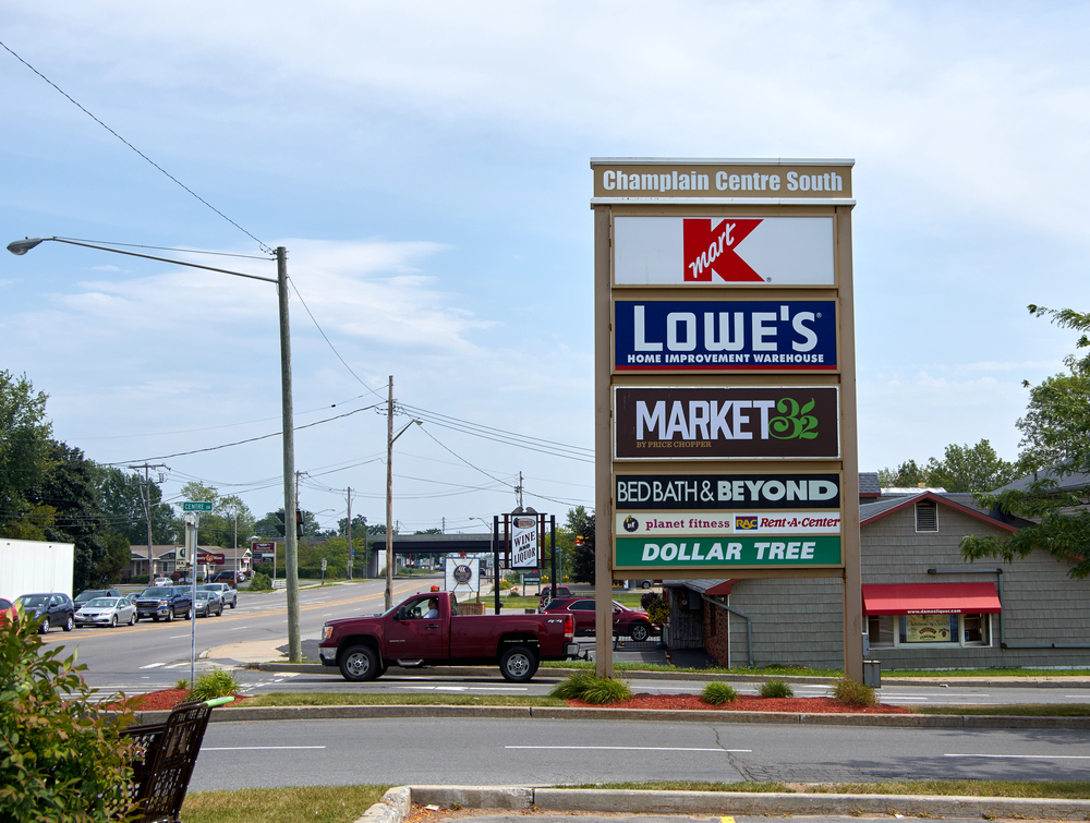
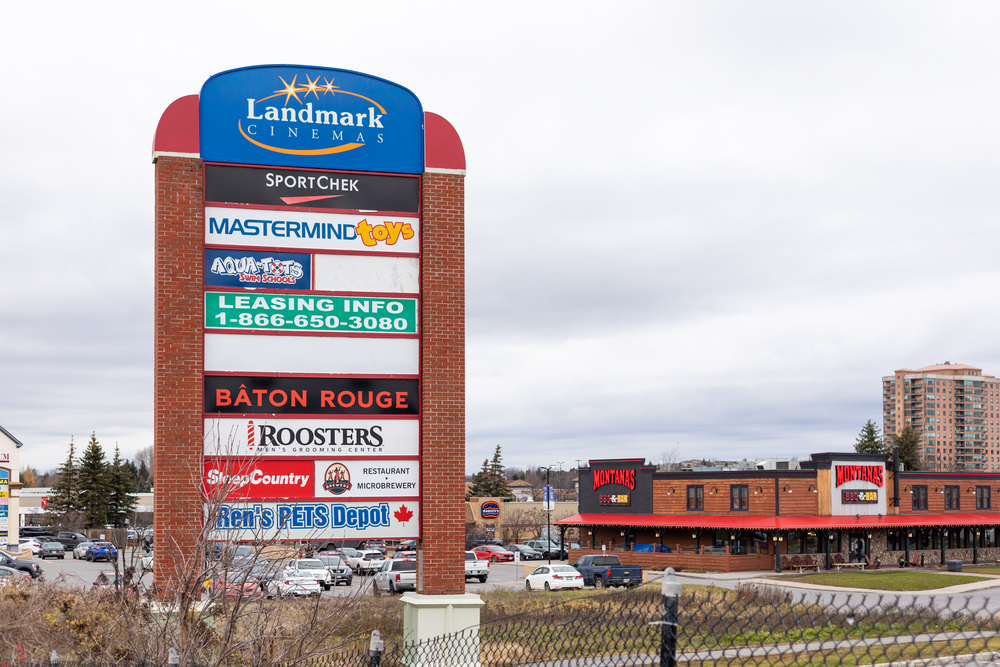
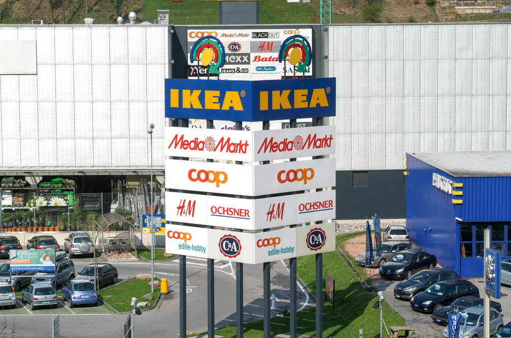
Pylon signs are tall structures typically placed near roadways or entrances, showcasing the names and logos of businesses within a shopping center. Their height and visibility make them effective for grabbing the attention of passing motorists and pedestrians. Pylon signs can be illuminated for 24/7 visibility and can be designed to reflect the branding of the shopping center, ensuring a cohesive look.
Why Eye-Catching Pylon Sign Designs Matter
If you want more people visiting the shops in the center, then your pylon signs are going to need a compelling design. Having a pylon sign is not enough. Here are some reasons why your pylon signs need an eye-catching design:
Attention-Grabbing
A well-designed pylon sign should be bold and visually appealing, instantly grabbing the attention of potential customers. Consider the placement of your sign and the surrounding environment; it should stand out against both. Use vibrant colors that reflect your brand and the essence of your shopping center. Clear, legible fonts and attractive graphics are essential for ensuring that your sign is easily readable from a distance, whether viewed by passing motorists or pedestrians. Think of your pylon sign as the first impression of your shopping center—an effective design can be the difference between someone driving past and someone deciding to stop in.
Incorporate Branding
The design of your pylon sign should align with the overall branding of your shopping center. Consistent colors, fonts, and design elements help create a professional image that resonates with visitors. A cohesive brand identity not only makes your shopping center memorable but also builds trust with potential customers.
Showcase Tenants
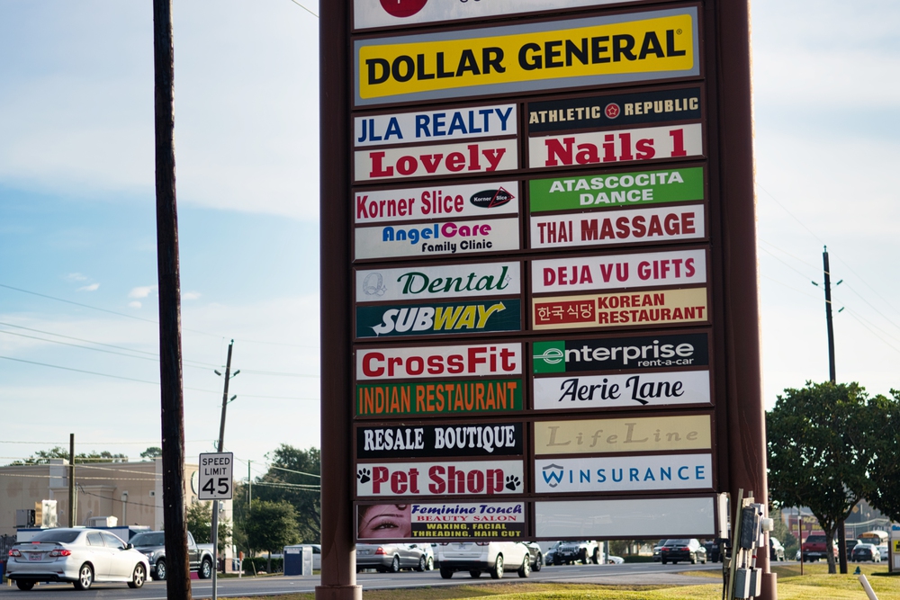
If your shopping center houses multiple businesses, your pylon sign should effectively showcase each tenant to maximize visibility. A balanced layout is crucial for ensuring that each business receives adequate representation, preventing any one name from overshadowing another. Consider designing sections within the sign that allow for equal space allocation while still highlighting the unique offerings of each tenant. This approach not only promotes individual stores but also communicates the diverse range of shopping and dining options available to potential customers. An effective sign can entice visitors by presenting a vibrant marketplace filled with choices, enhancing their overall shopping experience.

Placement of Pylon Signs is Key
It’s not just the design; it’s the location. Not surprising, right? Location is critical to the effectiveness of signage, even signage on pylons. Here are some tips for optimal positioning:
- High Traffic Areas: Position your pylon sign in locations with high vehicle and foot traffic to maximize visibility. Ensure it is easily seen from a distance and at different angles.
- Clear Sight Lines: Avoid obstructions that may block the view of your sign, such as trees or other structures. A clear sight line allows potential customers to spot your shopping center from afar.
- Consider Local Regulations: Be aware of local zoning laws and regulations regarding signage height and placement. Partnering with a knowledgeable sign company can help navigate these requirements.
Benefits of Illuminated Pylon Signs
Illuminated pylon signs offer an additional advantage by ensuring visibility even in low-light conditions. Not only do they offer height for drivers and foot traffic to see the sign from a distance. You can also boost the visibility with illumination. An illuminated sign provides round-the-clock advertising, keeping your shopping center visible day and night. This constant exposure can significantly increase foot traffic.
Furthermore, pylon signs enhance safety. Bright, well-lit signs improve visibility, helping customers find your shopping center safely, especially during evening hours.

Contact a Sign Company in Delaware for Your Pylon Sign Needs
Pylon signs are an excellent investment for shopping centers looking to boost foot traffic and enhance visibility. Working with an experienced sign company, like Tupp Signs, guarantees that your pylon sign is not only visually appealing but also built to withstand the elements. With a focus on eye-catching design, strategic placement, and professional craftsmanship, Tupp Signs can help you create the perfect pylon sign to attract more customers.
Contact Tupp Signs today to learn more about how we can assist you in maximizing your shopping center’s visibility with stunning pylon signs. Visit TuppSigns.com to get started!


