
Introduction
Have you ever walked into a building and instantly felt lost—unsure where to go, which direction to turn, or what door to open? That’s the silent failure of poor wayfinding signage.
Now imagine this: You step into a space, and everything feels intuitive. Clear, attractive signs guide you effortlessly. That’s what well-designed wayfinding signs that are both functional and attractive can do.
Whether you’re a business owner designing a new space, or a property manager upgrading your facility, the goal is simple—make navigation seamless while enhancing your brand image. This article will show you how to strike that perfect balance, transforming your environment and the experience of everyone who walks through it.
Understand the Purpose of Wayfinding Signage
Wayfinding signage isn’t just about pointing people in the right direction. It’s about creating a positive user journey through your physical environment. Done right, it supports:
- Navigation: Helping visitors move confidently through unfamiliar spaces.
- Accessibility: Ensuring all users, including those with disabilities, can find their way safely.
- Brand Presence: Reinforcing your identity visually and emotionally.
“Wayfinding should feel invisible—it works best when users don’t even realize they’re being guided.” – Tupp Signs Design Team

Key Principles of Functional Wayfinding Design
Clarity Is King
- Typography: Use sans-serif fonts (like Helvetica or Frutiger) for maximum legibility.
- Contrast: Ensure strong color contrast between text and background (e.g., white on navy blue).
- Size: Follow ADA guidelines—minimum 5/8” letter height for tactile signs.
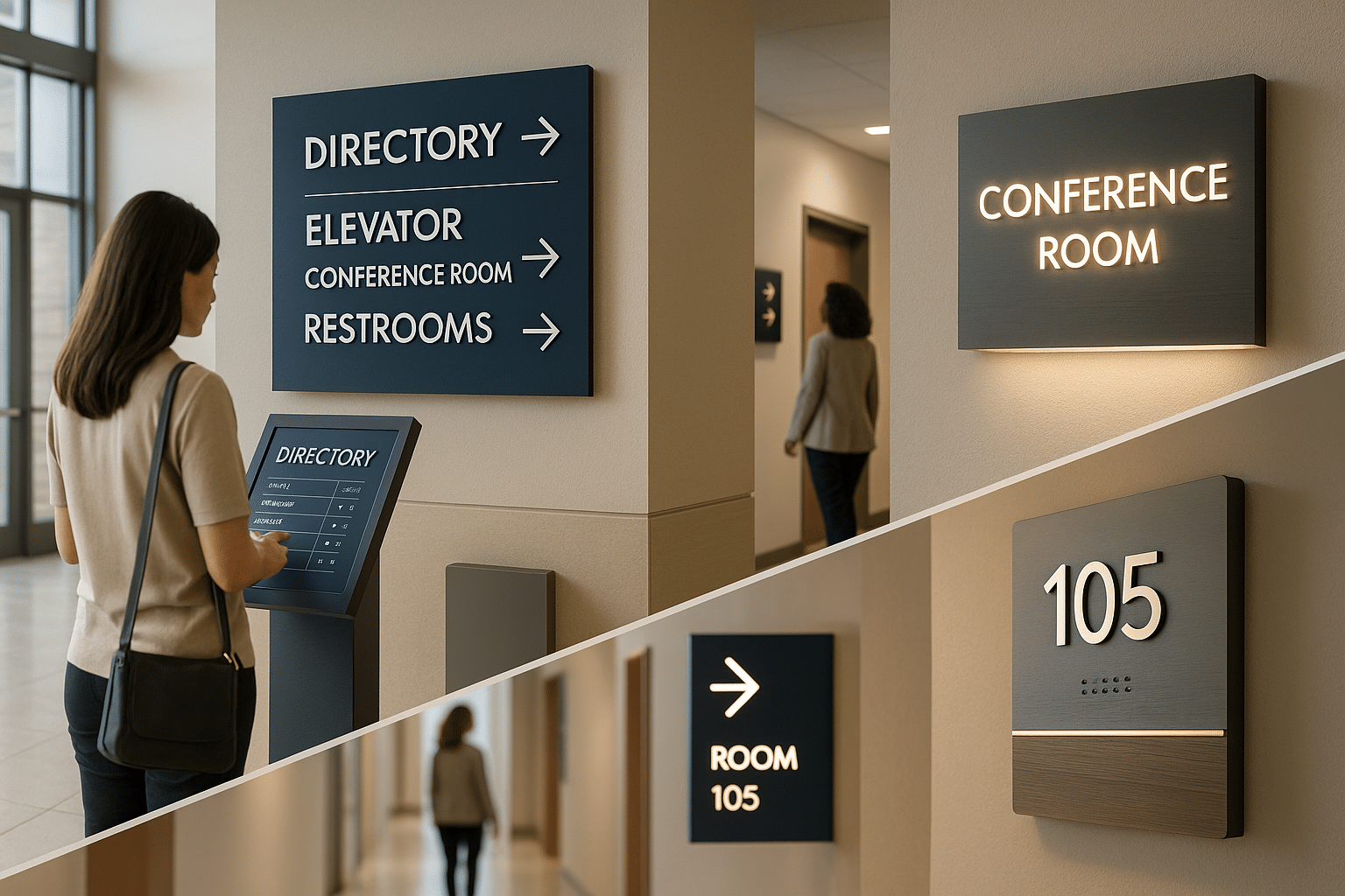
Logical Placement
- Position signs where decisions are made—at junctions, elevators, and exits.
- Keep signs within normal sightlines (4–6 feet from the floor).
Consistency
- Maintain a uniform layout, terminology, and visual language across all signs.
- Use standard symbols, especially for restrooms, exits, and elevators.
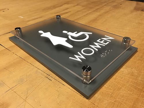
ADA Compliance
Design for inclusivity. Incorporate:
- Braille and tactile characters
- Non-glare surfaces
- High contrast visuals
Elements That Enhance Visual Appeal
Materials and Finishes
- Acrylic and metal laminates provide modern, professional aesthetics.
- Wood veneers add warmth in hospitality or residential settings.
- Glass or mirror-backed panels can evoke sophistication in corporate interiors.
Typography and Iconography
- Custom icon sets aligned with your brand tone elevate perception.
- Serif fonts or stylized scripts may work in luxury environments but must be used carefully.
Color Schemes
- Use your brand palette but ensure readability.
- Consider color psychology—blues for calm, greens for health, reds for urgency.
Dimensional and Lighting Effects
- Halo-lit letters or edge-lit panels add a modern, upscale touch.
- Layering materials creates depth and visual interest.
| Feature | Basic Wayfinding Signs | Custom-Styled Wayfinding Signs |
|---|---|---|
| Design Aesthetic | Utilitarian and standard | Tailored to match brand and environment |
| Materials Used | Standard acrylic or PVC | Brushed metal, wood veneer, glass, layered composites |
| Typography | Generic sans-serif fonts | Brand-aligned fonts or custom typefaces |
| Color Scheme | Neutral tones or stock colors | Custom colors based on brand palette |
| ADA Compliance | Meets minimum ADA standards | Integrates ADA elements seamlessly into the design |
| Iconography | Generic symbols | Custom or stylized icons consistent with brand tone |
| Lighting Effects | None | Optional halo-lit, backlit, or edge-lit enhancements |
| Visual Impact | Functional but plain | Visually engaging and memorable |
| Ideal Use Cases | Warehouses, utility areas, basic office layouts | Hotels, healthcare facilities, corporate offices, cultural spaces |
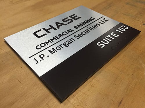
Integrating Brand Identity into Wayfinding
Wayfinding is a branding opportunity. Your signage should:
- Reflect your corporate identity through fonts, colors, and tone.
- Incorporate logos subtly without overwhelming function.
- Complement architectural and interior design choices.
Example: A wellness center might use soft curves, pastel tones, and natural materials for a calming effect.
Balancing Innovation and Simplicity
Use Technology Thoughtfully
- Digital directories and touchscreens offer dynamic updates but must be intuitive.
- QR codes can link to maps, directories, or room scheduling apps.
Custom vs. Modular
- Custom signs offer unique aesthetic value.
- Modular wayfinding systems allow for easy updates and are ideal for dynamic environments like hospitals or campuses.
Examples of Effective Wayfinding Signage
Case Study: Corporate Campus
Tupp Signs designed a custom wayfinding system for a regional headquarters that included:
- Color-coded floor identifiers
- Branded directional signs with backlit logos
- ADA-compliant room signs with interchangeable inserts
Result: A 35% reduction in visitor wayfinding questions at reception within three months.
Case Study: Medical Facility
We implemented a modular interior sign system with clear directional paths and tactile signage for a healthcare center. The design allowed for easy reconfiguration as departments expanded.
Result: Improved patient satisfaction scores related to navigation and facility experience.
Work with a Professional Sign Manufacturer
Designing beautiful and effective signs requires more than picking fonts and colors. It’s about experience, compliance, and execution.
At Tupp Signs, we offer:
- Signage design consultation
- Custom wayfinding signs for buildings and campuses
- ADA compliant sign design and manufacturing
- End-to-end project management—from concept to installation
Let us bring your vision to life with signage that guides, inspires, and elevates your space.
Conclusion
Creating wayfinding signage that is both functional and attractive is part science, part art. When done right, your signs do more than guide—they communicate brand identity, enhance aesthetics, and create memorable user experiences.
Need help designing your next signage system?
📞 Contact Tupp Signs for a custom signage consultation today.