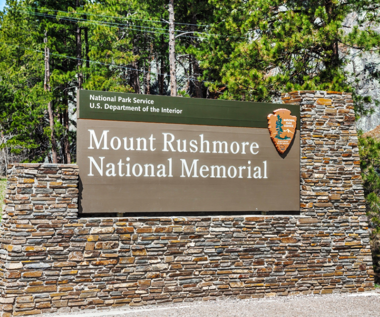
People zoom by locations every single day, sometimes not even realizing that the place they passed is where they were headed. That’s why business owners opt to put monument signs—large freestanding signage—out front of their property, especially if their store is concealed by trees or other obstacles. Monument signs can be designed in a number of ways to get your business noticed, and they are easily customizable.
Yet, while monument signs can be a boom to your business, there are some mistakes that owners make that could negatively affect the sign’s effectiveness. Here are some factors to keep in mind:
Color Choice
A bright, attention-grabbing sign is always preferable to an understated one. That’s why you have a sign to begin with! But if you think incorporating a slurry of bright colors into the sign design is a good idea, you might want to think again. Rather, the best practice is two or three contrasting colors that can be legible from a distance. This is especially important for individuals who have impaired vision.
Contrasting colors can look aesthetically appealing when used thoughtfully. You can find enticing pairs by looking at the color wheel and choosing two colors that are directly opposite of one another. A few examples include yellow on purple, white on black, white on dark or medium blue, and black on white. This is why many airports use yellow on black or vice versa for their navigational signage.
So make sure you have chosen your color scheme carefully. The last thing you want is a brilliant-looking sign with unreadable information!
Design Complexity
Signs, even thematic monument signs, need to be clear and simple in order to be effective. Since signage is meant to communicate a message, you don’t want the design to be so complex that the message is lost. Avoid choosing confusing text and graphics. People will only be driven away.
Furthermore, if the text is too small or difficult to read, potential customers will be turned away before they even get a chance to meet you or deal with your business.
How do you avoid such a pitfall? Avoid scattering too many words around the monument sign face. Keep statements visible by maximizing the font size and choosing fonts that are legible from afar. You also want to use as little text as you can to keep the message concise.
Remember, a monument sign is often along a road where cars are speeding by. You have only a few moments to tell people about your location and what is there, so keep the design simple and clear.
Sign Placement
A reason you get a monument sign is for the appeal. Most monument signs are meant to be eye-catching and easy to spot, even when the design is simple. However, even if you make your monument sign look incredible, there is one thing that could negatively impact its influence. Placement.
Yes, the location of your sign can make all the difference in its success. Worse, if you don’t have your monument sign set up in the right place, it will be downright ineffective.
Carefully consider where you wish to install the monument sign. Think about from which angle people will see the sign, how the sun hits the materials, if there are any obstacles blocking it from view, and so on. You want the sign to be visible from at least 100 feet back.
Durability of the Materials
Monument signs are outdoor signs, meaning they are continuously subjected to all kinds of environmental factors. Wind, rain, sleet, hail, smoke, heat…your monument sign will either be resilient or break down from these things. The strength of the design depends on the durability of the materials used. This is why you can’t purchase a cheap monument sign and hope that it lasts because the materials aren’t going to be designed for the environment.
You want to select materials that are long-lasting, weather-resistant, and strong. The best thing is to discuss your material options with a business sign company. They will have technicians and designers who can come up with an appealing style that can withstand the weather. For example, the designers might suggest stone and aluminum for elegance and stability, while armored foam and aluminum are the more cost-effective choice.
Let the sign company know what you are looking for. There are dozens of materials that can be customized or made to fit within your budget.
Some popular material options include:
- Armored foam
- Armour Wood
- Brick
- Concrete
- Wood
- Stone
- Metal
- Stucco
- Plastic
- DuraWood
- Dibond
Call Tupp Signs Today
Monument signs are a beautiful and cost-effective way to advertise your business to the passerby. But in order to do what they are made to do, monument signs need to be carefully crafted with quality materials and installed in the proper spot. Consider the four factors mentioned in this article when getting a monument sign; you’ll have no problems if you do.
And if you are looking for a monument sign for your business, give Tupp Signs a call today. We’ve been designing monument signs and other outdoor signage since 1928 and would love to help you with your project.


