
Designing a sign is two-parts being careful and one-part creativity. You need to think about more than how good the sign looks close up. Think about readability, traffic patterns, the position of the sun, the way colors change when illuminated or in the glare of the sun, and so on. Size, lighting, placement, and other considerations are involved when bringing your signage to life.
Let’s have a look at the factors that help you use signage effectively.
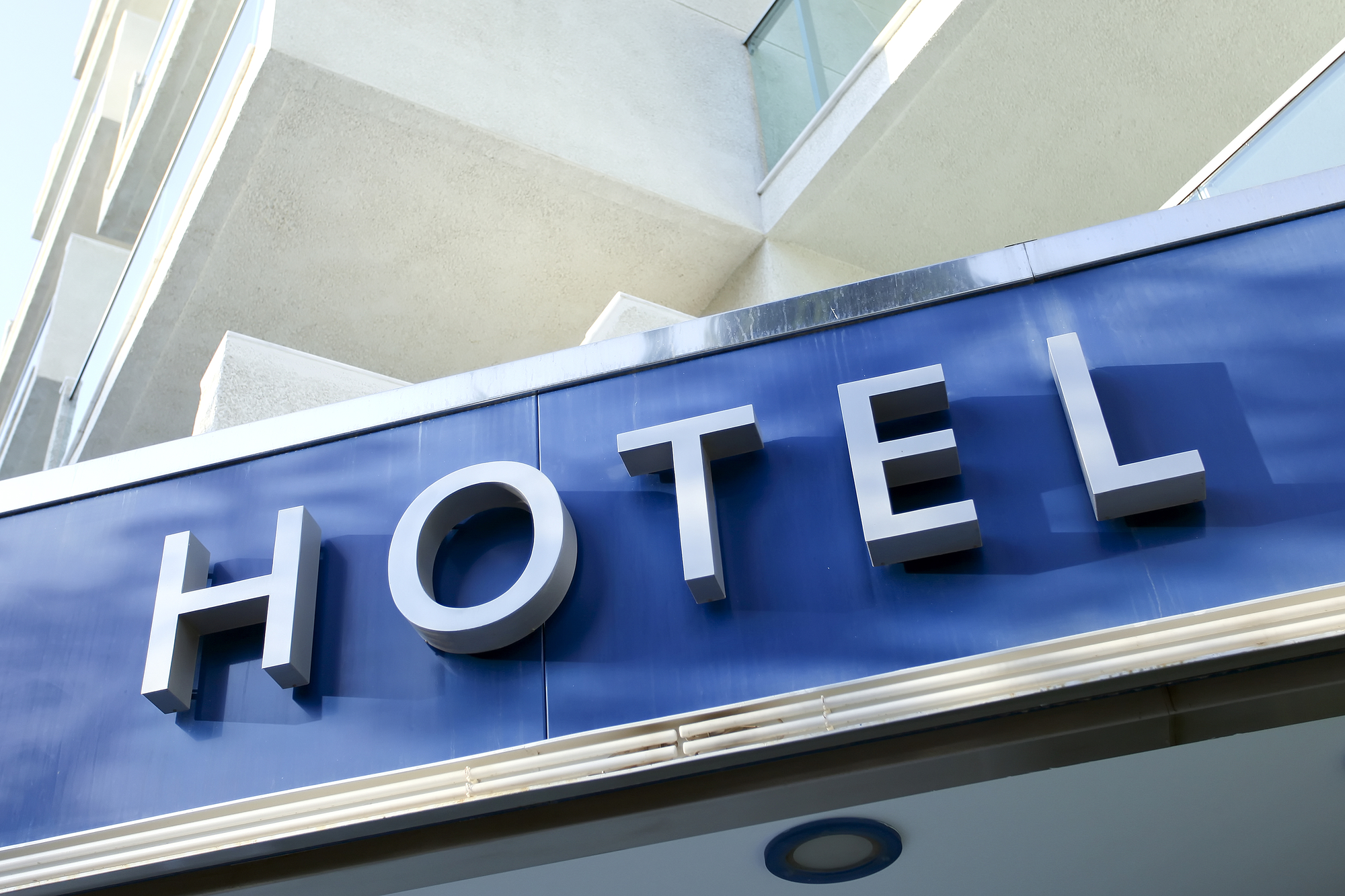
Typography
Signs along the road typically need to be seen about 300 yards away, meaning that the typeface is going to have different requirements from what you see in the newspaper or magazines or on a computer screen. Throughout the world, there are fonts that are used to accommodate the language the sign is in, allowing for legible spacing, height, and width.
Since signage is all about seizing the moment and gaining attention, you need to limit blurry letters and maximize the legibility of every single letter. Some of the best fonts to do this include:
- Wayfinding Sans
- Frutiger LT Roman
- Arial
- Franklin Gothic Medium
- Garamond Premier Pro
- P22 Johnston Underground
If you use these fonts or can find similar fonts to these that work well for your sign, people will be able to see the letters much clearer, and your message will be transmitted to more potential customers.
Effective Coloring and Placement
Did you know that at 55 miles per hour, the viewer is moving at about 80 feet per second and would thus need 265-720 feet of distance to see the sign clearly? If your customers cannot see your sign clearly from this distance, you need to change the design. Two factors can make your sign more clear: coloring and placement. Authors of “Visual Communication Through Signage,” James and Karen Claus, ranked the following color combinations most readable:
- Black on yellow
- Yellow on blue
- Green on white
- Black on white
- Yellow on black
- White on green
- White on blue
- Blue on yellow
The colors ranked least readable were:
- White on brown
- Yellow on brown
- Brown on yellow
- Red on white
- Yellow on red
- White on red
- Red on yellow
Of course, it doesn’t come down solely to the color combinations of words and shapes on the sign. Placement also impacts how color is viewed. White reflects back the most light, while black absorbs the most light. Blue and green are in the middle. This affects legibility in the evening and when positioned in direct sunlight.
The placement of letters, depending on the color, can cause sections of words to blend together or be more difficult to read at certain angles. Reportedly, in order for a sign to be most effective, it should have about 40 feet of distance for every inch of letter height, allowing for maximum comprehension throughout the day. Lettering should also include strokes that are one-fifth of the letter height.
Furthermore, the Sign Research Foundation discovered that maximum readability, a sign must “be detectable, conspicuous, legible, and comprehensible.” Signs should also be positioned within a driver’s cone of vision to aid in keep their eyes on the road while reading the sign. In scientific terms, the clearest viewpoint within the cone of vision is about 3-degrees around where the eye focuses. Beyond 10-degrees of the cone, readability is severely restricted and may cause the driver to remove their eyes from the road.
Dimensions
Assuming you are within the 300-700 feet range, you need to figure out the length of the letters. Experts have long recommended using the formula of one-inch tall for every 25 feet of length of distance between the viewer and the sign.
If you opt to use fancier fonts, the minimum size increases significantly. While fancy script is not recommended for signage, you can indeed strike a balance between aesthetics and functionality.
Also keep in mind that a small, plain sign without graphics is never effective. Size is important, but the typography, location of logos, and other details need to be recognizable as well.
Illumination
Effectiveness of a sign can be increased with installing illumination. Two main benefits stem from this: people can read brightened signs more easily, and the sign will be readable 24 hours a day, even in inclement weather conditions. Even when you have closed up for the night, the sign will still be playing a marketing role.
The best lighting options are neon and LED. These can be installed three ways:
- Lamps mounted around the outer edges of the sign to shine directly on the face
- Internal bulbs that shine through the face
- Electronic Message Centers (EMCs)
- Illuminated elements like neon tubing and LED bulbs.
The possibilities of illumination are endless. Technology is always advancing, so you can usually light up your sign the way you want. Naturally, the brightness of a sign is going to be impacted by the color of the sign’s face that you choose. As noted above, some color schemes are better for illumination than others, so you should think about how your printed media is going to behave as a sign.
Be sure to read Sign Brightness Recommendations by the International Sign Association [1] to get a better understanding of illumination.
As you can see, sign effectiveness depends on a number of factors that interplay with one another to create a valuable marketing tool. When designing your sign with a professional team, be sure to think about sign angle, location, contrasting colors, luminance, and size. Doing so will grant you a great sign that attracts customers for many years.
Are you ready to investment in awesome signage? Need to request a quote? Then it’s time to fill out the contact form!
References
[1] http://www.signs.org/media/files/ISA_EMC_Recommendations_Refresh_FINAL.pdf