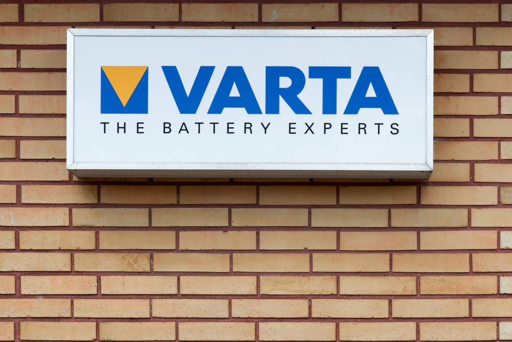
Your storefront sign is one of the most important investments you can make for your business. It’s often the first impression potential customers have of your brand, and it can be the deciding factor in whether they choose to step inside or keep walking. One popular choice for storefront signage is the cabinet sign, also known as a box sign, which offers great visibility and customization options. However, choosing the right cabinet sign isn’t as simple as it may seem.
Many businesses make avoidable mistakes that end up costing them time, money, and potential customers. As an experienced sign company in Delaware, Tupp Signs has seen these mistakes firsthand. In this guide, we’ll outline the 7 most common mistakes to avoid when choosing a cabinet sign for your storefront to ensure you get the most out of your investment.
1. Choosing the Wrong Size
One of the most frequent mistakes businesses make is selecting a sign that’s either too large or too small for their storefront. A sign that’s too large can overwhelm your space and look unprofessional, while a sign that’s too small might not be noticeable from a distance.
How to Avoid This Mistake:
- Measure the available space on your storefront and choose a sign size that complements it without overpowering it.
- Consider the viewing distance – your sign should be large enough to be readable from the street but not so big that it looks out of place.
- Use this general rule: 1 inch of letter height for every 10 feet of viewing distance.
Pro Tip: Tupp Signs offers expert advice on choosing the right size for your cabinet sign based on your storefront and location, ensuring maximum visibility.
2. Overlooking Lighting Options
Lighting is a crucial aspect of cabinet signs, especially if you want your business to stand out after dark. Many businesses make the mistake of neglecting this important feature, resulting in a sign that’s barely visible at night.
How to Avoid This Mistake:
- Opt for LED illumination, which is energy-efficient, long-lasting, and offers excellent brightness.
- Consider backlit or front-lit options to make your sign visible from a distance and in low-light conditions.
- If you’re in an area with heavy foot traffic at night, invest in high-quality lighting to ensure your sign attracts attention.
Related Resource: Check out our guide on LED signage options to learn more about lighting solutions for your cabinet sign.

3. Choosing Low-Quality Materials
Your cabinet sign will be exposed to the elements year-round, which means it needs to be made from durable, weather-resistant materials. Opting for cheap or low-quality materials might save you money upfront, but it will end up costing you more in the long run when you need to replace or repair it frequently.
How to Avoid This Mistake:
- Choose high-quality materials such as aluminum, acrylic, or polycarbonate, which can withstand harsh weather conditions.
- Work with a reputable sign company in Delaware like Tupp Signs that uses premium materials designed to last.
4. Ignoring Local Zoning Laws and Regulations
Every city has zoning laws and regulations regarding the size, height, lighting, and placement of signs. Failing to comply with these regulations can result in costly fines, forced removal, or redesign of your sign.
How to Avoid This Mistake:
- Research your local zoning laws or consult with a professional sign company that’s familiar with your area’s regulations.
- Obtain any necessary permits before installing your sign to avoid potential legal issues.
Expert Tip: As a top Delaware sign company, Tupp Signs handles the permitting process for you, ensuring your sign complies with all local regulations.
5. Using Unreadable Fonts and Colors
Your cabinet sign’s primary function is to convey information to potential customers quickly and clearly. Using overly decorative fonts or poor color combinations can make your sign difficult to read, resulting in lost business opportunities.
How to Avoid This Mistake:
- Choose simple, bold fonts that are easy to read from a distance, such as Arial, Helvetica, or Futura.
- Use high-contrast color combinations (e.g., black text on a white background) to ensure your message stands out.
- Limit your sign to two or three colors to avoid visual clutter.
Related Article: For more insights on effective color and font choices, read our guide on designing impactful signs.
6. Failing to Match Your Brand Identity
Your sign should be a reflection of your brand’s personality and values. One of the biggest mistakes businesses make is choosing a sign that doesn’t align with their brand, which can confuse potential customers and weaken your brand image.
How to Avoid This Mistake:
- Use colors, fonts, and design elements that are consistent with your brand’s identity.
- Ensure your logo is prominently displayed on your sign to increase brand recognition.
- Work with a sign company that understands your brand and can create a design that reflects your business’s personality.
Did You Know? Tupp Signs offers custom design services to help your cabinet sign match your brand’s identity perfectly.
7. Not Considering Future Changes
Businesses grow and evolve over time, and so should your signage. Many business owners forget to plan for future changes, which can lead to additional costs if you need to update your sign frequently.
How to Avoid This Mistake:
- Choose a sign design that allows for easy updates, such as interchangeable panels or graphics.
- Consider digital display options if you expect to change your messaging frequently.
- Work with a sign company that offers flexible design solutions to accommodate future changes.
Pro Tip: Tupp Signs can design a cabinet sign with future growth in mind, ensuring it remains relevant as your business evolves.
Final Thoughts: Avoid These Mistakes with the Help of a Trusted Sign Company
Choosing the right cabinet sign for your storefront can make a significant impact on your business’s success. By avoiding these common mistakes, you’ll ensure that your sign is not only eye-catching but also durable, readable, and aligned with your brand identity.
Ready to invest in a cabinet sign that gets results? Contact Tupp Signs, the leading sign company in Delaware, for expert guidance and high-quality signage solutions. We specialize in creating custom cabinet signs that help your business stand out and attract more customers.
Get in touch today by visiting TuppSigns.com or calling us to schedule a consultation. Let’s design a cabinet sign that sets your business apart from the competition!


